Secure Checkout
Protected payments
Buyer Protection
Eligible purchases covered
Customer Support
Help when needed
CTCA Preferred
Certified Trading Card Association
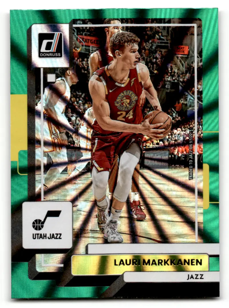
2022-23 Donruss Holo Green Laser #176 Lauri Markkanen NM-MT Jazz ID:57895
2022-23 Donruss Holo Green Laser #176 Lauri Markkanen NM-MT
*****Updated 05/17/22*****
One to five trading cards (depending on thickness) will be shipped in each Card Saver (semi-ridgid - NOT A TOPLOAD) inside a standard letter envelope (PWE - Plain White Envelope) No USPS Tracking available with a FREE or $.99 shipping charge. Get tracking with either First Class (shipped in a bubble mailer) or Priority Shipping (shipped in a flat rate envelope). Simply Sandoval usually ships within 2 business days Monday thru Friday. Please contact Simply Sandoval/simply-cards on eBay if you have any questions regarding this listing. Please have the item number available. Simply Sandoval has been family owned and operated since 1993. We take pride in accurate grading, fair pricing, and excellent customer service. We have been online since 1993 selling sports cards and handmade items.
Grading Sports Cards
These are the grading standards that we use and follow!
Mint (MT) -- A card with four sharp corners, 50/50 centering, no imperfections or signs of wear. Even cards straight out of the pack do not always grade mint. Pre-1970 MT cards typically sell at 150 percent or more of the NM price. *We don't list cards in this grade* Near Mint - Mint - (NrMt-Mt) - A card with one minor flaw. Any one of the following would lower a Mint card to Near Mint-Mint: one corner with a slight touch of wear, barely noticeable print spots, color or focus imperfections. The card must have 60/40 or better centering in both directions, original gloss, smooth edges and original color borders. Near Mint (NM) -- A near-perfect card with perhaps one minor imperfection, such as one blunt corner. Centering is no worse than 60/40 and the card must have its original gloss. NM cards are the standard by which other grades are usually gauged. Example: MT cards bring 150 percent of book. Excellent-Mint (EX-MT) -- A card with only two or three minor imperfections. Must have original gloss and centering no worse than 70/30. EX-MT cards typically sell for 75 to 90 percent of the NM price. Excellent (EX) -- A card with a few minor imperfections. Some original gloss is lost and the edges show moderate wear. All four corners typically show some wear. Centering is no worse than 75/25. EX cards usually sell for 50 percent to 75 percent of the NM price. Very Good (VG) -- A card that shows obvious handling but is still attractive despite wear and imperfections. A VG card may have a crease, but one that's not severe enough to make the card unattractive. Most of the original gloss is lost. VG cards usually sell for 25 percent to 35 percent of the NM price. Good (G), Fair (F), Poor (P) -- A very worn card with many major imperfections. Collectors use cards of these grades as fillers until better ones can be found. With very little market for such cards, they are valued at 5 percent to 10 percent of the NM price. Creases and major defects if present are mentioned in the description or title of the item for sale or bid.
*** PLEASE NOTE: All shipping with USPS is taking longer than normal. Please be advised it may take 21+ days for delivery US only and 60 days International.***
This listing created with GLETech Multiple Selling Channel tools.
FILE 2: PRODUCT THREE COLUMN CSS
======================================================================
/*
* Marketplace Product Page - Full Replacement Layout
* Desktop: gallery + unified purchase panel
* Tablet: balanced two-column layout, then single-column below 900px
* Mobile: conversion-first single-column flow
*/
.marketplace-product-shell,
.marketplace-product-shell * {
box-sizing: border-box;
}
.marketplace-product-shell {
--mp-border: rgba(var(--color-foreground), 0.14);
--mp-border-strong: rgba(var(--color-foreground), 0.22);
--mp-surface: rgb(var(--color-background));
--mp-muted: rgba(var(--color-foreground), 0.68);
--mp-radius: 14px;
--mp-radius-small: 10px;
--mp-shadow: 0 12px 32px rgba(0, 0, 0, 0.07);
--mp-gap: clamp(1.6rem, 2.2vw, 3.2rem);
display: grid !important;
grid-template-columns: minmax(0, 1.35fr) minmax(360px, 0.9fr) !important;
gap: var(--mp-gap) !important;
align-items: start !important;
width: 100% !important;
max-width: 100% !important;
margin: 2rem 0 3rem !important;
}
.marketplace-product-shell > .product__media-wrapper,
.marketplace-product-shell > .product__info-wrapper {
width: 100% !important;
min-width: 0 !important;
max-width: none !important;
margin: 0 !important;
}
/* Gallery card */
.marketplace-product-shell > .product__media-wrapper {
grid-column: 1;
padding: clamp(1rem, 1.8vw, 2rem) !important;
background: var(--mp-surface);
border: 2px solid #c9a84c;
border-radius: var(--mp-radius);
box-shadow: var(--mp-shadow);
overflow: hidden;
}
.marketplace-product-shell .product__media-wrapper media-gallery,
.marketplace-product-shell .product__media-wrapper slider-component,
.marketplace-product-shell .product__media-wrapper .product__media-list {
width: 100% !important;
max-width: 100% !important;
min-width: 0 !important;
}
.marketplace-product-shell .product__media-wrapper .product__media-item,
.marketplace-product-shell .product__media-wrapper .product-media-container,
.marketplace-product-shell .product__media-wrapper .product__media {
max-width: 100% !important;
}
.marketplace-product-shell .product__media-wrapper img,
.marketplace-product-shell .product__media-wrapper video,
.marketplace-product-shell .product__media-wrapper iframe,
.marketplace-product-shell .product__media-wrapper model-viewer {
max-width: 100% !important;
}
.marketplace-product-shell .product__media-wrapper img {
width: 100% !important;
height: auto !important;
max-height: min(72vh, 760px) !important;
object-fit: contain !important;
}
.marketplace-product-shell .product-media-container,
.marketplace-product-shell .product__media {
display: flex !important;
align-items: center;
justify-content: center;
min-height: 0 !important;
overflow: hidden;
border-radius: var(--mp-radius-small);
}
.marketplace-product-shell .thumbnail-list {
gap: 0.8rem;
}
.marketplace-product-shell .thumbnail {
border-radius: 8px;
overflow: hidden;
}
.marketplace-product-shell .slider-buttons {
display: flex !important;
align-items: center;
justify-content: center;
gap: 0.8rem;
margin-top: 1rem;
}
.marketplace-product-shell .slider-counter {
display: flex !important;
align-items: center;
justify-content: center;
min-width: 5rem;
font-weight: 700;
}
/* Unified right-side purchase panel */
.marketplace-product-shell > .product__info-wrapper {
grid-column: 2;
padding: 0 !important;
background: transparent !important;
border: 0 !important;
overflow: visible !important;
}
.marketplace-product-shell .marketplace-purchase-card {
width: 100%;
min-width: 0;
padding: clamp(1.4rem, 2vw, 2.4rem);
background: var(--mp-surface);
border: 2px solid #c9a84c;
border-radius: var(--mp-radius);
box-shadow: var(--mp-shadow);
}
@media screen and (min-width: 1200px) {
.marketplace-product-shell .marketplace-purchase-card {
position: sticky;
top: 2rem;
}
}
/* Conditional auction and seller credentials */
.marketplace-dynamic-panel[hidden],
.marketplace-auction-section[hidden],
.marketplace-credentials-section[hidden] {
display: none !important;
}
.marketplace-product-shell .marketplace-dynamic-panel {
display: none;
width: 100%;
min-width: 0;
max-width: 100%;
margin: 0 0 1.6rem;
padding: 1.2rem;
background: rgba(var(--color-foreground), 0.025);
border: 1px solid var(--mp-border);
border-radius: var(--mp-radius-small);
overflow: hidden;
}
.marketplace-product-shell .marketplace-dynamic-panel.is-visible {
display: block;
}
.marketplace-product-shell .marketplace-auction-section,
.marketplace-product-shell .marketplace-credentials-section {
width: 100%;
min-width: 0;
max-width: 100%;
}
.marketplace-product-shell .marketplace-dynamic-panel.has-both .marketplace-credentials-section {
margin-top: 1.2rem !important;
padding-top: 1.2rem;
border-top: 1px solid var(--mp-border);
}
.marketplace-product-shell .marketplace-dynamic-panel:not(.has-auction) .marketplace-credentials-section {
margin-top: 0 !important;
padding-top: 0;
border-top: 0;
}
.marketplace-product-shell .marketplace-dynamic-panel #wk-auction,
.marketplace-product-shell .marketplace-dynamic-panel #wk-auction > *,
.marketplace-product-shell .marketplace-dynamic-panel .wk_seller_badge_div {
width: 100% !important;
max-width: 100% !important;
min-width: 0 !important;
margin-left: 0 !important;
box-sizing: border-box;
}
.marketplace-product-shell .marketplace-dynamic-panel #wk-auction * {
max-width: 100%;
box-sizing: border-box;
overflow-wrap: anywhere;
}
.marketplace-product-shell .marketplace-dynamic-panel #wk-auction:empty,
.marketplace-product-shell .marketplace-dynamic-panel .wk_seller_badge_div:empty {
display: none !important;
}
.marketplace-product-shell .seller-badges-header {
margin-bottom: 0.8rem;
}
.marketplace-product-shell .seller-badges-title {
margin: 0;
font-size: 1.4rem;
line-height: 1.3;
}
.marketplace-product-shell .wk_seller_badge_div {
display: flex;
flex-wrap: wrap;
gap: 0.7rem;
align-items: center;
}
.marketplace-product-shell .wk_seller_badge_div img {
width: auto;
max-width: 64px;
height: auto;
max-height: 48px;
object-fit: contain;
}
/* Seller identity */
.marketplace-product-shell .product__seller-info-top {
display: grid;
grid-template-columns: auto minmax(0, 1fr);
gap: 1rem;
align-items: center;
width: 100%;
margin: 0 0 1.4rem !important;
padding: 0 0 1.4rem !important;
border-bottom: 1px solid var(--mp-border);
}
.marketplace-product-shell .product__seller-info-top .wk_seller_store_logo,
.marketplace-product-shell .product__seller-info-top .wk_seller_detail {
width: auto;
min-width: 0;
margin: 0 !important;
text-align: left !important;
}
.marketplace-product-shell .product__seller-info-top .wk_seller_store_logo img {
display: block;
width: auto;
max-width: 110px;
height: auto;
max-height: 56px;
object-fit: contain;
}
.marketplace-product-shell .wk_seller_info {
width: 100%;
margin: 0 0 1.2rem !important;
}
/* Product information and forms */
.marketplace-product-shell .product__info-container,
.marketplace-product-shell .product__info-container > *,
.marketplace-product-shell .product-form,
.marketplace-product-shell .product-form__input,
.marketplace-product-shell .product-form__buttons,
.marketplace-product-shell .shopify-payment-button,
.marketplace-product-shell .shopify-payment-button__button {
width: 100%;
max-width: 100%;
min-width: 0;
}
.marketplace-product-shell .product__info-container > * + * {
margin-top: 1.2rem;
}
.marketplace-product-shell .price,
.marketplace-product-shell .price--large {
line-height: 1.15;
}
.marketplace-product-shell .main-price-quantity {
display: grid;
grid-template-columns: minmax(0, 1fr) auto;
gap: 1.2rem;
align-items: end;
width: 100%;
}
.marketplace-product-shell .cus_price_block {
min-width: 0;
}
.marketplace-product-shell .product-form__quantity {
margin: 0;
}
.marketplace-product-shell button,
.marketplace-product-shell .button,
.marketplace-product-shell input[type="button"],
.marketplace-product-shell input[type="submit"],
.marketplace-product-shell select,
.marketplace-product-shell input[type="text"],
.marketplace-product-shell input[type="number"] {
max-width: 100%;
}
.marketplace-product-shell .product-form__buttons button,
.marketplace-product-shell .product-form__buttons .button,
.marketplace-product-shell .product-form__buttons input[type="button"],
.marketplace-product-shell .product-form__buttons input[type="submit"],
.marketplace-product-shell .product-form__buttons a,
.marketplace-product-shell #wk_make_an_offer_btn,
.marketplace-product-shell #wk-askme button,
.marketplace-product-shell #wk-askme a,
.marketplace-product-shell .custom-share-button,
.marketplace-product-shell .shopify-payment-button__button {
width: 100% !important;
max-width: 100% !important;
min-width: 0 !important;
min-height: 48px;
margin-left: 0 !important;
margin-right: 0 !important;
white-space: normal !important;
text-overflow: clip !important;
}
.marketplace-product-shell .product-form__buttons > *,
.marketplace-product-shell #wk_make_an_offer,
.marketplace-product-shell #wk-askme,
.marketplace-product-shell #make_an_offer_btn_div {
width: 100% !important;
max-width: 100% !important;
min-width: 0 !important;
margin-left: 0 !important;
margin-right: 0 !important;
}
.marketplace-product-shell table {
width: 100% !important;
max-width: 100%;
table-layout: auto;
}
.marketplace-product-shell iframe,
.marketplace-product-shell video,
.marketplace-product-shell svg,
.marketplace-product-shell img {
max-width: 100%;
}
/* ==========================================================
HORIZONTAL OVERFLOW PROTECTION
Keeps app widgets, sliders, and injected content inside the page.
========================================================== */
[id^="MainProduct-"] {
width: 100%;
max-width: 100%;
overflow-x: hidden;
overflow-x: clip;
}
[id^="MainProduct-"] .page-width,
[id^="MainProduct-"] .marketplace-product-shell,
[id^="MainProduct-"] .marketplace-product-shell > *,
[id^="MainProduct-"] .marketplace-purchase-card,
[id^="MainProduct-"] media-gallery,
[id^="MainProduct-"] slider-component,
[id^="MainProduct-"] product-info,
[id^="MainProduct-"] .product__media-list,
[id^="MainProduct-"] .product__info-container,
[id^="MainProduct-"] #wk-auction,
[id^="MainProduct-"] [class*="wk_"],
[id^="MainProduct-"] [id*="wk-"] {
min-width: 0 !important;
max-width: 100% !important;
}
[id^="MainProduct-"] img,
[id^="MainProduct-"] video,
[id^="MainProduct-"] iframe,
[id^="MainProduct-"] svg,
[id^="MainProduct-"] table,
[id^="MainProduct-"] input,
[id^="MainProduct-"] select,
[id^="MainProduct-"] textarea,
[id^="MainProduct-"] button {
max-width: 100%;
}
[id^="MainProduct-"] table {
width: 100%;
}
[id^="MainProduct-"] iframe {
width: 100%;
}
/* ==========================================================
MARKETPLACE TRUST BANNER
========================================================== */
.mp-trust-banner,
.mp-trust-banner * {
box-sizing: border-box;
}
.mp-trust-banner {
width: 100%;
max-width: 100%;
margin: 0 0 1.8rem;
color: rgb(var(--color-foreground));
overflow: hidden;
border: 1px solid rgba(var(--color-foreground), 0.14);
border-radius: 14px;
background: rgb(var(--color-background));
box-shadow: 0 6px 20px rgba(0, 0, 0, 0.045);
}
.mp-trust-banner__inner {
display: grid;
grid-template-columns: minmax(160px, 0.8fr) minmax(0, 2.2fr) minmax(200px, 1fr);
align-items: stretch;
width: 100%;
max-width: 100%;
min-width: 0;
}
.mp-trust-banner__heading,
.mp-trust-banner__ctca {
display: flex;
align-items: center;
min-width: 0;
padding: 1.2rem 1.4rem;
}
.mp-trust-banner__heading {
gap: 0.75rem;
font-size: 1.35rem;
font-weight: 750;
line-height: 1.2;
background: rgba(23, 107, 69, 0.055);
}
.mp-trust-banner__heading-icon,
.mp-trust-benefit__icon {
display: inline-flex;
flex: 0 0 auto;
align-items: center;
justify-content: center;
color: #176b45;
}
.mp-trust-banner__benefits {
display: grid;
grid-template-columns: repeat(3, minmax(0, 1fr));
align-items: stretch;
min-width: 0;
border-left: 1px solid rgba(var(--color-foreground), 0.12);
border-right: 1px solid rgba(var(--color-foreground), 0.12);
}
.mp-trust-benefit {
display: flex;
align-items: center;
justify-content: center;
gap: 0.75rem;
min-width: 0;
padding: 1rem 1.1rem;
}
.mp-trust-benefit + .mp-trust-benefit {
border-left: 1px solid rgba(var(--color-foreground), 0.1);
}
.mp-trust-benefit__icon {
width: 34px;
height: 34px;
border-radius: 50%;
background: rgba(23, 107, 69, 0.08);
}
.mp-trust-benefit__text,
.mp-trust-banner__ctca-text {
display: block;
min-width: 0;
line-height: 1.2;
}
.mp-trust-benefit__text strong,
.mp-trust-benefit__text small,
.mp-trust-banner__ctca-text strong,
.mp-trust-banner__ctca-text small {
display: block;
overflow-wrap: anywhere;
}
.mp-trust-benefit__text strong,
.mp-trust-banner__ctca-text strong {
font-size: 1.25rem;
}
.mp-trust-benefit__text small,
.mp-trust-banner__ctca-text small {
margin-top: 0.2rem;
color: rgba(var(--color-foreground), 0.65);
font-size: 1.05rem;
}
.mp-trust-banner__ctca {
gap: 0.8rem;
}
.mp-trust-banner__ctca-image {
flex: 0 0 auto;
width: 46px;
height: 46px;
object-fit: contain;
}
@media screen and (max-width: 1099px) {
.mp-trust-banner__inner {
grid-template-columns: minmax(150px, 0.8fr) minmax(0, 2fr);
}
.mp-trust-banner__ctca {
grid-column: 1 / -1;
justify-content: center;
padding: 0.9rem 1.2rem;
border-top: 1px solid rgba(var(--color-foreground), 0.1);
}
}
@media screen and (max-width: 749px) {
.mp-trust-banner {
margin-bottom: 1.2rem;
border-radius: 12px;
}
.mp-trust-banner__inner {
display: block;
}
.mp-trust-banner__heading {
justify-content: center;
padding: 0.9rem 1rem;
font-size: 1.25rem;
}
.mp-trust-banner__benefits {
grid-template-columns: repeat(3, minmax(0, 1fr));
border: 0;
border-top: 1px solid rgba(var(--color-foreground), 0.1);
}
.mp-trust-benefit {
flex-direction: column;
justify-content: flex-start;
gap: 0.45rem;
padding: 0.9rem 0.45rem;
text-align: center;
}
.mp-trust-benefit__icon {
width: 30px;
height: 30px;
}
.mp-trust-benefit__text strong {
font-size: 1.05rem;
}
.mp-trust-benefit__text small {
display: none;
}
.mp-trust-banner__ctca {
justify-content: center;
padding: 0.8rem 1rem;
}
.mp-trust-banner__ctca-image {
width: 38px;
height: 38px;
}
.mp-trust-banner__ctca-text strong {
font-size: 1.1rem;
}
.mp-trust-banner__ctca-text small {
font-size: 0.95rem;
}
}
@media screen and (max-width: 390px) {
.mp-trust-benefit__text strong {
font-size: 0.95rem;
}
}
/* Unified description and policy box */
.seller-info-unified-wrapper {
width: 100%;
max-width: none;
margin: 2rem 0;
padding: 0;
}
.seller-info-unified-box {
background: linear-gradient(135deg, #ffffff 0%, #f8fafc 100%);
border: 2px solid #c9a84c;
border-radius: 20px;
padding: 1.25rem 2rem;
box-shadow: 0 8px 24px rgba(0, 0, 0, 0.08), 0 2px 8px rgba(0, 0, 0, 0.04);
transition: all 0.3s cubic-bezier(0.4, 0, 0.2, 1);
position: relative;
overflow: hidden;
}
.seller-info-unified-box::before {
content: '';
position: absolute;
top: 0;
left: 0;
right: 0;
height: 4px;
background: linear-gradient(90deg, #c9a84c, #d4b560, #c9a84c);
opacity: 0;
transition: opacity 0.3s ease;
}
.seller-info-unified-box:hover::before {
opacity: 1;
}
.seller-info-unified-box:hover {
transform: translateY(-2px);
box-shadow: 0 12px 32px rgba(0, 0, 0, 0.12), 0 4px 12px rgba(0, 0, 0, 0.06);
border-color: #d4b560;
}
.seller-info-section {
padding: 1.5rem 0;
}
.seller-info-section:first-child {
padding-top: 0;
}
.seller-info-section:last-child {
padding-bottom: 0;
}
.seller-info-header {
display: flex;
align-items: center;
gap: 0.8rem;
margin-bottom: 1rem;
padding-bottom: 0.75rem;
border-bottom: 2px solid #e2e8f0;
}
.seller-info-title {
margin: 0;
font-size: 1.25rem;
font-weight: 700;
color: #1e293b;
letter-spacing: -0.02em;
}
.seller-info-icon {
flex-shrink: 0;
width: 36px;
height: 36px;
border-radius: 10px;
background: linear-gradient(135deg, #c9a84c, #b8963d);
display: flex;
align-items: center;
justify-content: center;
color: white;
box-shadow: 0 4px 12px rgba(201, 168, 76, 0.3);
padding: 6px;
}
.seller-info-icon svg {
width: 100%;
height: 100%;
}
.seller-info-separator {
height: 2px;
background: #e2e8f0;
margin: 1.5rem 0;
}
/* Mobile styles for seller info unified box */
@media screen and (max-width: 749px) {
.seller-info-unified-box {
padding: 1.25rem 1.5rem;
border-radius: 16px;
}
.seller-info-section {
padding: 1.25rem 0;
}
.seller-info-header {
gap: 0.6rem;
margin-bottom: 0.75rem;
}
.seller-info-title {
font-size: 1.125rem;
}
.seller-info-icon {
width: 32px;
height: 32px;
}
.seller-info-separator {
margin: 1.25rem 0;
}
}
@media (prefers-reduced-motion: reduce) {
.seller-info-unified-box {
animation: none !important;
transition: none !important;
}
.seller-info-unified-box:hover {
transform: none;
}
}
/* Tablet */
@media screen and (max-width: 1099px) {
.marketplace-product-shell {
grid-template-columns: minmax(0, 1.1fr) minmax(320px, 0.9fr) !important;
gap: 1.8rem !important;
}
.marketplace-product-shell .marketplace-purchase-card {
padding: 1.4rem;
}
.marketplace-product-shell .main-price-quantity {
grid-template-columns: 1fr;
align-items: start;
}
}
/* Small tablet and mobile: conversion-first single column */
@media screen and (max-width: 899px) {
.marketplace-product-shell {
display: flex !important;
flex-direction: column;
gap: 1.5rem !important;
margin-top: 1.5rem !important;
}
.marketplace-product-shell > .product__media-wrapper {
order: 1;
}
.marketplace-product-shell > .product__info-wrapper {
order: 2;
}
.marketplace-product-shell .marketplace-purchase-card {
position: static;
}
.marketplace-product-shell .product__media-wrapper img {
max-height: 620px !important;
}
}
/* Phone */
@media screen and (max-width: 749px) {
.section-main-product .page-width {
padding-left: 1.2rem;
padding-right: 1.2rem;
}
.marketplace-product-shell {
gap: 1.2rem !important;
margin: 1rem 0 2rem !important;
}
.marketplace-product-shell > .product__media-wrapper,
.marketplace-product-shell .marketplace-purchase-card {
border-radius: 12px;
}
.marketplace-product-shell > .product__media-wrapper {
padding: 0.8rem !important;
}
.marketplace-product-shell .marketplace-purchase-card {
padding: 1.2rem;
}
.marketplace-product-shell .product__media-list.slider,
.marketplace-product-shell .product__media-list.slider--mobile {
display: flex !important;
overflow-x: auto !important;
scroll-snap-type: x mandatory;
scroll-behavior: smooth;
gap: 0 !important;
}
.marketplace-product-shell .product__media-item,
.marketplace-product-shell .product__media-item.grid__item,
.marketplace-product-shell .slider__slide {
flex: 0 0 100% !important;
width: 100% !important;
max-width: 100% !important;
min-width: 100% !important;
scroll-snap-align: start;
}
.marketplace-product-shell .product__media-wrapper img {
max-height: 72vh !important;
}
.marketplace-product-shell .thumbnail-list {
display: none !important;
}
.marketplace-product-shell .slider-buttons {
margin-top: 0.7rem;
}
.marketplace-product-shell .marketplace-dynamic-panel {
padding: 1rem;
}
.marketplace-product-shell .product__seller-info-top {
grid-template-columns: 72px minmax(0, 1fr);
}
.marketplace-product-shell .product__seller-info-top .wk_seller_store_logo img {
max-width: 72px;
max-height: 48px;
}
.marketplace-product-shell .wk_seller_badge_div {
flex-wrap: nowrap;
overflow-x: auto;
padding-bottom: 0.4rem;
scroll-snap-type: x proximity;
}
.marketplace-product-shell .wk_seller_badge_div > * {
flex: 0 0 auto;
scroll-snap-align: start;
}
.marketplace-product-shell .product-form__buttons button,
.marketplace-product-shell .product-form__buttons .button,
.marketplace-product-shell .product-form__buttons input[type="button"],
.marketplace-product-shell .product-form__buttons input[type="submit"],
.marketplace-product-shell .product-form__buttons a,
.marketplace-product-shell .shopify-payment-button__button {
min-height: 50px;
font-size: 1.5rem;
line-height: 1.25;
}
.seller-info-section {
padding: 1.4rem;
}
.wk-mvm-shipping-days-div select,
.wk-mvm-shipping-days-div input,
.wk-mvm-shipping-days-div button {
width: 100% !important;
}
}
/* Narrow phone */
@media screen and (max-width: 420px) {
.marketplace-product-shell .product__seller-info-top {
grid-template-columns: 1fr;
}
.marketplace-product-shell .product__seller-info-top .wk_seller_store_logo img {
max-width: 100px;
}
}
/* Final defensive containment for injected marketplace/app content */
@media screen and (max-width: 899px) {
[id^="MainProduct-"] .marketplace-product-shell,
[id^="MainProduct-"] .product__media-wrapper,
[id^="MainProduct-"] .product__info-wrapper,
[id^="MainProduct-"] .marketplace-purchase-card {
width: 100% !important;
max-width: 100% !important;
min-width: 0 !important;
}
[id^="MainProduct-"] .product__media-list.slider,
[id^="MainProduct-"] .product__media-list.slider--mobile {
width: 100% !important;
max-width: 100% !important;
margin-left: 0 !important;
margin-right: 0 !important;
padding-left: 0 !important;
padding-right: 0 !important;
}
[id^="MainProduct-"] .product__media-item,
[id^="MainProduct-"] .slider__slide {
max-width: 100% !important;
}
}
/* ==========================================================
DEFINITIVE FINAL FIX — cards, gallery controls, actions,
share behavior, and horizontal overflow.
========================================================== */
html,
body {
max-width: 100%;
overflow-x: clip;
}
[id^="MainProduct-"] {
width: 100%;
max-width: 100%;
overflow-x: clip !important;
}
[id^="MainProduct-"] .page-width,
[id^="MainProduct-"] .marketplace-product-shell,
[id^="MainProduct-"] .marketplace-product-shell > *,
[id^="MainProduct-"] .marketplace-card,
[id^="MainProduct-"] .marketplace-info-card__inner,
[id^="MainProduct-"] .marketplace-purchase-card,
[id^="MainProduct-"] media-gallery,
[id^="MainProduct-"] slider-component,
[id^="MainProduct-"] product-info {
min-width: 0 !important;
max-width: 100% !important;
box-sizing: border-box !important;
}
/* Identical outer card treatment for the two columns. */
.marketplace-product-shell {
align-items: stretch !important;
}
.marketplace-product-shell > .marketplace-card {
width: 100% !important;
min-width: 0 !important;
max-width: 100% !important;
height: 100% !important;
margin: 0 !important;
padding: clamp(1.4rem, 2vw, 2.4rem) !important;
border: 1px solid var(--mp-border) !important;
border-radius: var(--mp-radius) !important;
background: var(--mp-surface) !important;
box-shadow: var(--mp-shadow) !important;
overflow: hidden !important;
}
.marketplace-product-shell > .marketplace-info-card,
.marketplace-product-shell .marketplace-info-card__inner,
.marketplace-product-shell .marketplace-purchase-card {
display: flex !important;
flex-direction: column !important;
width: 100% !important;
min-width: 0 !important;
}
.marketplace-product-shell .marketplace-info-card__inner,
.marketplace-product-shell .marketplace-purchase-card {
flex: 1 1 auto !important;
}
/* Outer right column is the card; remove the nested card appearance. */
.marketplace-product-shell .marketplace-purchase-card {
height: 100% !important;
padding: 0 !important;
border: 0 !important;
border-radius: 0 !important;
background: transparent !important;
box-shadow: none !important;
position: static !important;
top: auto !important;
overflow: visible !important;
}
/* Gallery: clip media only, never the controls/counter. */
.marketplace-product-shell .marketplace-media-card {
display: flex !important;
flex-direction: column !important;
}
.marketplace-product-shell .marketplace-media-card media-gallery,
.marketplace-product-shell .marketplace-media-card slider-component {
display: flex !important;
flex: 1 1 auto !important;
flex-direction: column !important;
width: 100% !important;
min-width: 0 !important;
overflow: visible !important;
}
.marketplace-product-shell .marketplace-media-card .product__media-list {
width: 100% !important;
min-width: 0 !important;
max-width: 100% !important;
margin: 0 !important;
}
.marketplace-product-shell .marketplace-media-card .product__media-item,
.marketplace-product-shell .marketplace-media-card .product-media-container,
.marketplace-product-shell .marketplace-media-card .product__media {
min-width: 0 !important;
max-width: 100% !important;
}
.marketplace-product-shell .marketplace-media-card .slider-buttons {
position: relative !important;
z-index: 10 !important;
display: flex !important;
flex: 0 0 auto !important;
align-items: center !important;
justify-content: center !important;
gap: 10px !important;
width: 100% !important;
min-height: 48px !important;
margin: 12px 0 0 !important;
padding: 2px 0 !important;
overflow: visible !important;
}
.marketplace-product-shell .marketplace-media-card .slider-counter,
.marketplace-product-shell .marketplace-media-card .slider-counter-below {
position: static !important;
display: flex !important;
align-items: center !important;
justify-content: center !important;
width: auto !important;
min-width: 88px !important;
max-width: none !important;
height: 38px !important;
min-height: 38px !important;
margin: 0 !important;
padding: 0 12px !important;
overflow: visible !important;
visibility: visible !important;
opacity: 1 !important;
white-space: nowrap !important;
line-height: 1 !important;
font-size: 14px !important;
font-weight: 700 !important;
}
.marketplace-product-shell .marketplace-media-card .slider-button {
flex: 0 0 44px !important;
width: 44px !important;
min-width: 44px !important;
height: 44px !important;
margin: 0 !important;
}
/* Permanently suppress all legacy expanding Share interfaces. */
.marketplace-product-shell share-button,
.marketplace-product-shell .share-button,
.marketplace-product-shell .product__share,
.marketplace-product-shell .custom-share-button-wrapper,
.marketplace-product-shell .share-button__fallback,
.marketplace-product-shell details[class*="share" i] {
display: none !important;
width: 0 !important;
height: 0 !important;
min-height: 0 !important;
margin: 0 !important;
padding: 0 !important;
border: 0 !important;
overflow: hidden !important;
}
/* One predictable full-width action stack. */
.marketplace-product-shell .product-form__buttons {
--mp-action-gap: 10px;
display: flex !important;
flex-direction: column !important;
align-items: stretch !important;
gap: var(--mp-action-gap) !important;
width: 100% !important;
min-width: 0 !important;
max-width: 100% !important;
margin: 0 !important;
padding: 0 !important;
}
.marketplace-product-shell .product-form__buttons > *,
.marketplace-product-shell #wk_make_an_offer,
.marketplace-product-shell #make_an_offer_btn_div,
.marketplace-product-shell #wk-askme,
.marketplace-product-shell .custom_dynamic_btns {
width: 100% !important;
min-width: 0 !important;
max-width: 100% !important;
margin: 0 !important;
padding-left: 0 !important;
padding-right: 0 !important;
float: none !important;
align-self: stretch !important;
}
.marketplace-product-shell .marketplace-action-is-empty,
.marketplace-product-shell [hidden] {
display: none !important;
margin: 0 !important;
padding: 0 !important;
}
.marketplace-product-shell .product-form__submit,
.marketplace-product-shell .product-form__buttons button,
.marketplace-product-shell .product-form__buttons a.button,
.marketplace-product-shell .product-form__buttons input[type="button"],
.marketplace-product-shell .product-form__buttons input[type="submit"],
.marketplace-product-shell #wk_make_an_offer_btn,
.marketplace-product-shell #wk_make_an_offer button,
.marketplace-product-shell #wk_make_an_offer input,
.marketplace-product-shell #wk-askme a,
.marketplace-product-shell #wk-askme button,
.marketplace-product-shell .wk-ask-a-question,
.marketplace-product-shell .marketplace-native-share-button,
.marketplace-product-shell .shopify-payment-button__button {
display: flex !important;
align-items: center !important;
justify-content: center !important;
width: 100% !important;
min-width: 0 !important;
max-width: 100% !important;
min-height: 52px !important;
height: auto !important;
margin: 0 !important;
padding: 12px 16px !important;
float: none !important;
box-sizing: border-box !important;
border-radius: 10px !important;
font-family: inherit !important;
font-size: 15px !important;
font-weight: 700 !important;
line-height: 1.2 !important;
text-align: center !important;
text-decoration: none !important;
white-space: normal !important;
}
/* Text-only controls. */
.marketplace-product-shell .product-form__buttons :is(svg, img, picture, .icon, [class*="icon" i], [class*="heart" i]),
.marketplace-product-shell #wk_make_an_offer :is(svg, img, .icon),
.marketplace-product-shell #wk-askme :is(svg, img, .icon) {
display: none !important;
}
.marketplace-product-shell .product-form__submit,
.marketplace-product-shell button[name="add"],
.marketplace-product-shell .shopify-payment-button__button--unbranded {
color: #fff !important;
background: #0e5a3b !important;
border: 1px solid #0e5a3b !important;
box-shadow: none !important;
}
.marketplace-product-shell .product-form__submit:hover,
.marketplace-product-shell button[name="add"]:hover,
.marketplace-product-shell .shopify-payment-button__button--unbranded:hover {
background: #0b4a30 !important;
border-color: #0b4a30 !important;
}
.marketplace-product-shell #wk_make_an_offer_btn,
.marketplace-product-shell #wk_make_an_offer button,
.marketplace-product-shell #wk_make_an_offer input,
.marketplace-product-shell #wk-askme a,
.marketplace-product-shell #wk-askme button,
.marketplace-product-shell .wk-ask-a-question,
.marketplace-product-shell .marketplace-native-share-button {
color: #172033 !important;
background: #fff !important;
border: 1px solid #cbd5e1 !important;
box-shadow: none !important;
}
.marketplace-product-shell .marketplace-native-share-button {
background: #f3f5f7 !important;
cursor: pointer !important;
}
/* App content can never widen the page. */
.marketplace-product-shell #wk-auction,
.marketplace-product-shell #wk-auction *,
.marketplace-product-shell [class*="wk_"],
.marketplace-product-shell [id*="wk-"],
.marketplace-product-shell table,
.marketplace-product-shell iframe,
.marketplace-product-shell video,
.marketplace-product-shell img,
.marketplace-product-shell svg,
.marketplace-product-shell input,
.marketplace-product-shell select,
.marketplace-product-shell textarea,
.marketplace-product-shell button {
max-width: 100% !important;
box-sizing: border-box !important;
}
.marketplace-product-shell table,
.marketplace-product-shell iframe {
width: 100% !important;
}
@media screen and (max-width: 899px) {
.marketplace-product-shell {
align-items: stretch !important;
}
.marketplace-product-shell > .marketplace-card,
.marketplace-product-shell .marketplace-info-card__inner,
.marketplace-product-shell .marketplace-purchase-card {
height: auto !important;
min-height: 0 !important;
}
}
@media screen and (max-width: 749px) {
.marketplace-product-shell > .marketplace-card {
padding: 12px !important;
border-radius: 12px !important;
}
.marketplace-product-shell .product__media-list.slider,
.marketplace-product-shell .product__media-list.slider--mobile {
width: 100% !important;
max-width: 100% !important;
margin: 0 !important;
padding: 0 !important;
overflow-x: auto !important;
overflow-y: hidden !important;
overscroll-behavior-x: contain;
scrollbar-width: none;
}
.marketplace-product-shell .product__media-list.slider::-webkit-scrollbar,
.marketplace-product-shell .product__media-list.slider--mobile::-webkit-scrollbar {
display: none;
}
.marketplace-product-shell .product__media-item,
.marketplace-product-shell .slider__slide {
flex: 0 0 100% !important;
width: 100% !important;
min-width: 100% !important;
max-width: 100% !important;
}
}
/* ==========================================================
FINAL STABILITY PATCH - v2
Keep this block at the absolute end of this stylesheet.
========================================================== */
html,
body {
width: 100% !important;
max-width: 100% !important;
overflow-x: hidden !important;
}
[id^="MainProduct-"] .page-width {
width: 100% !important;
max-width: 100% !important;
overflow-x: clip !important;
}
/* Both desktop columns are the same physical card. */
@media screen and (min-width: 900px) {
.marketplace-product-shell {
grid-auto-rows: 1fr !important;
align-items: stretch !important;
}
.marketplace-product-shell > .marketplace-card {
height: 100% !important;
min-height: 100% !important;
padding: clamp(1.4rem, 2vw, 2.4rem) !important;
border: 1px solid var(--mp-border) !important;
border-radius: var(--mp-radius) !important;
background: var(--mp-surface) !important;
box-shadow: var(--mp-shadow) !important;
}
.marketplace-product-shell > .marketplace-info-card,
.marketplace-product-shell .marketplace-info-card__inner,
.marketplace-product-shell .marketplace-purchase-card {
height: 100% !important;
}
}
/* Do not let the gallery viewport clip its controls or counter. */
.marketplace-product-shell .marketplace-media-card {
overflow: visible !important;
}
.marketplace-product-shell .marketplace-media-card media-gallery,
.marketplace-product-shell .marketplace-media-card slider-component {
height: auto !important;
min-height: 0 !important;
overflow: visible !important;
padding-bottom: 2px !important;
}
.marketplace-product-shell .marketplace-media-card .product__media-list {
overflow: hidden !important;
}
.marketplace-product-shell .marketplace-media-card .slider-buttons {
position: relative !important;
inset: auto !important;
display: flex !important;
width: 100% !important;
min-height: 52px !important;
margin: 12px 0 0 !important;
padding: 4px 0 !important;
overflow: visible !important;
}
.marketplace-product-shell .marketplace-media-card .slider-buttons .slider-counter {
display: flex !important;
position: static !important;
width: auto !important;
min-width: 90px !important;
height: 40px !important;
min-height: 40px !important;
padding: 0 12px !important;
overflow: visible !important;
white-space: nowrap !important;
line-height: 40px !important;
}
/* Prevent a second counter from overlapping or being clipped. */
.marketplace-product-shell .marketplace-media-card .slider-counter-below {
display: none !important;
}
/* Dawn/Webkul expanding Share UI must never render. */
[id^="MainProduct-"] share-button,
[id^="MainProduct-"] .share-button,
[id^="MainProduct-"] .product__share,
[id^="MainProduct-"] .custom-share-button-wrapper,
[id^="MainProduct-"] .share-button__fallback,
[id^="MainProduct-"] details[class*="share" i] {
display: none !important;
visibility: hidden !important;
width: 0 !important;
min-width: 0 !important;
max-width: 0 !important;
height: 0 !important;
min-height: 0 !important;
margin: 0 !important;
padding: 0 !important;
border: 0 !important;
overflow: hidden !important;
pointer-events: none !important;
}
/* The only Share control allowed. */
[id^="MainProduct-"] .marketplace-native-share-button {
display: flex !important;
align-items: center !important;
justify-content: center !important;
width: 100% !important;
min-width: 0 !important;
max-width: 100% !important;
min-height: 52px !important;
margin: 10px 0 0 !important;
padding: 12px 16px !important;
border: 1px solid #cbd5e1 !important;
border-radius: 10px !important;
color: #172033 !important;
background: #f3f5f7 !important;
box-shadow: none !important;
font-family: inherit !important;
font-size: 15px !important;
font-weight: 700 !important;
line-height: 1.2 !important;
text-align: center !important;
cursor: pointer !important;
}
/* Defensive containment without creating a second page scrollbar. */
[id^="MainProduct-"] .marketplace-product-shell,
[id^="MainProduct-"] .marketplace-product-shell > *,
[id^="MainProduct-"] .marketplace-card,
[id^="MainProduct-"] .marketplace-info-card__inner,
[id^="MainProduct-"] .marketplace-purchase-card,
[id^="MainProduct-"] media-gallery,
[id^="MainProduct-"] slider-component,
[id^="MainProduct-"] product-info,
[id^="MainProduct-"] #wk-auction,
[id^="MainProduct-"] [class*="wk_"],
[id^="MainProduct-"] [id*="wk-"] {
min-width: 0 !important;
max-width: 100% !important;
box-sizing: border-box !important;
}
@media screen and (max-width: 899px) {
.marketplace-product-shell > .marketplace-card,
.marketplace-product-shell .marketplace-info-card__inner,
.marketplace-product-shell .marketplace-purchase-card {
height: auto !important;
min-height: 0 !important;
}
}
@media screen and (max-width: 749px) {
.marketplace-product-shell .marketplace-media-card {
overflow: hidden !important;
}
.marketplace-product-shell .marketplace-media-card .product__media-list.slider,
.marketplace-product-shell .marketplace-media-card .product__media-list.slider--mobile {
overflow-x: auto !important;
overflow-y: hidden !important;
overscroll-behavior-x: contain;
max-width: 100% !important;
}
.marketplace-product-shell .marketplace-media-card .slider-buttons {
overflow: visible !important;
}
}
/* ==========================================================
FINAL V3 PATCH: gallery arrows, one Share control, spacing,
and stable action colors. Keep this block last.
========================================================== */
/* Restore the previous/next gallery controls at every viewport. */
[id^="MainProduct-"] .marketplace-media-card .slider-buttons {
display: flex !important;
visibility: visible !important;
opacity: 1 !important;
align-items: center !important;
justify-content: center !important;
gap: 10px !important;
width: 100% !important;
min-height: 54px !important;
margin: 12px 0 0 !important;
padding: 4px 0 !important;
position: relative !important;
z-index: 20 !important;
overflow: visible !important;
}
[id^="MainProduct-"] .marketplace-media-card .slider-button,
[id^="MainProduct-"] .marketplace-media-card button.slider-button {
display: inline-flex !important;
visibility: visible !important;
opacity: 1 !important;
align-items: center !important;
justify-content: center !important;
flex: 0 0 44px !important;
width: 44px !important;
min-width: 44px !important;
max-width: 44px !important;
height: 44px !important;
min-height: 44px !important;
margin: 0 !important;
padding: 0 !important;
border: 1px solid #cbd5e1 !important;
border-radius: 50% !important;
color: #172033 !important;
background: #ffffff !important;
box-shadow: none !important;
pointer-events: auto !important;
cursor: pointer !important;
}
[id^="MainProduct-"] .marketplace-media-card .slider-button svg {
display: block !important;
visibility: visible !important;
width: 18px !important;
height: 18px !important;
max-width: 18px !important;
max-height: 18px !important;
color: currentColor !important;
}
[id^="MainProduct-"] .marketplace-media-card .slider-button[disabled] {
display: inline-flex !important;
opacity: 0.35 !important;
cursor: default !important;
}
/* Remove every legacy Share presentation; only the native button remains. */
[id^="MainProduct-"] :is(
share-button,
.share-button,
.product__share,
.custom-share-button-wrapper,
.share-button__fallback,
details[class*="share" i],
.custom-share-button:not(.marketplace-native-share-button)
) {
display: none !important;
visibility: hidden !important;
width: 0 !important;
height: 0 !important;
min-height: 0 !important;
margin: 0 !important;
padding: 0 !important;
overflow: hidden !important;
pointer-events: none !important;
}
/* One action stack with reliable spacing, including app-injected actions. */
[id^="MainProduct-"] .product-form__buttons {
display: flex !important;
flex-direction: column !important;
align-items: stretch !important;
gap: 12px !important;
width: 100% !important;
margin: 0 !important;
padding: 0 !important;
}
[id^="MainProduct-"] .product-form__buttons > * {
width: 100% !important;
min-width: 0 !important;
max-width: 100% !important;
margin: 0 !important;
padding-left: 0 !important;
padding-right: 0 !important;
align-self: stretch !important;
}
/* Remove margins inside wrappers so the flex gap is the only spacing source. */
[id^="MainProduct-"] .product-form__buttons > * > :is(button, a, input[type="button"], input[type="submit"]),
[id^="MainProduct-"] .product-form__buttons > :is(button, a, input[type="button"], input[type="submit"]) {
margin-top: 0 !important;
margin-bottom: 0 !important;
}
/* Lock geometry and colors so app/theme rules cannot change them again. */
[id^="MainProduct-"] .product-form__buttons :is(
.product-form__submit,
button,
a.button,
input[type="button"],
input[type="submit"],
.marketplace-native-share-button
) {
width: 100% !important;
min-width: 0 !important;
max-width: 100% !important;
min-height: 52px !important;
margin: 0 !important;
padding: 12px 16px !important;
border-radius: 10px !important;
box-sizing: border-box !important;
font-family: inherit !important;
font-size: 15px !important;
font-weight: 700 !important;
line-height: 1.2 !important;
text-align: center !important;
justify-content: center !important;
}
/* Primary purchase action. */
[id^="MainProduct-"] .product-form__buttons :is(.product-form__submit, button[name="add"]) {
color: #ffffff !important;
background: #0e5a3b !important;
border: 1px solid #0e5a3b !important;
}
[id^="MainProduct-"] .product-form__buttons :is(.product-form__submit, button[name="add"]):hover {
color: #ffffff !important;
background: #0b4a30 !important;
border-color: #0b4a30 !important;
}
/* All secondary actions, including Like, Message, Offer, and Share. */
[id^="MainProduct-"] .product-form__buttons :is(
button:not([name="add"]):not(.product-form__submit),
a.button,
input[type="button"],
input[type="submit"]:not([name="add"]),
.marketplace-native-share-button
) {
color: #172033 !important;
background: #ffffff !important;
border: 1px solid #cbd5e1 !important;
box-shadow: none !important;
}
[id^="MainProduct-"] .product-form__buttons .marketplace-native-share-button {
display: flex !important;
visibility: visible !important;
height: auto !important;
min-height: 52px !important;
cursor: pointer !important;
}
@media screen and (max-width: 749px) {
[id^="MainProduct-"] .product-form__buttons {
gap: 10px !important;
}
[id^="MainProduct-"] .marketplace-media-card .slider-buttons {
min-height: 50px !important;
margin-top: 8px !important;
}
[id^="MainProduct-"] .marketplace-media-card .slider-button,
[id^="MainProduct-"] .marketplace-media-card button.slider-button {
flex-basis: 42px !important;
width: 42px !important;
min-width: 42px !important;
max-width: 42px !important;
height: 42px !important;
min-height: 42px !important;
}
}
/* ==========================================================
FINAL V4 ACTION RHYTHM + CONVERSION COLORS
Keep this block last. It standardizes every visible action.
========================================================== */
[id^="MainProduct-"] .marketplace-purchase-card {
--mp-final-action-gap: 14px;
--mp-final-action-height: 54px;
--mp-final-action-radius: 10px;
}
/* The action stack owns all spacing. No child may add its own margins. */
[id^="MainProduct-"] .product-form__buttons {
display: grid !important;
grid-template-columns: minmax(0, 1fr) !important;
gap: var(--mp-final-action-gap) !important;
width: 100% !important;
max-width: 100% !important;
margin: 0 !important;
padding: 0 !important;
}
[id^="MainProduct-"] .product-form__buttons > *,
[id^="MainProduct-"] .product-form__buttons > * > *,
[id^="MainProduct-"] .product-form__buttons .shopify-payment-button,
[id^="MainProduct-"] .product-form__buttons .shopify-payment-button__button,
[id^="MainProduct-"] .product-form__buttons #wk_make_an_offer,
[id^="MainProduct-"] .product-form__buttons #make_an_offer_btn_div,
[id^="MainProduct-"] .product-form__buttons #wk-askme,
[id^="MainProduct-"] .product-form__buttons .custom_dynamic_btns {
width: 100% !important;
min-width: 0 !important;
max-width: 100% !important;
margin: 0 !important;
box-sizing: border-box !important;
}
/* Every visible customer action is exactly the Add to Cart size. */
[id^="MainProduct-"] .product-form__buttons :is(
.product-form__submit,
button,
a.button,
input[type="button"],
input[type="submit"],
.shopify-payment-button__button,
.marketplace-native-share-button
) {
display: flex !important;
align-items: center !important;
justify-content: center !important;
width: 100% !important;
min-width: 0 !important;
max-width: 100% !important;
height: var(--mp-final-action-height) !important;
min-height: var(--mp-final-action-height) !important;
max-height: var(--mp-final-action-height) !important;
margin: 0 !important;
padding: 0 18px !important;
border-radius: var(--mp-final-action-radius) !important;
box-sizing: border-box !important;
font-family: inherit !important;
font-size: 15px !important;
font-weight: 750 !important;
line-height: 1 !important;
letter-spacing: 0.02em !important;
text-align: center !important;
text-decoration: none !important;
white-space: nowrap !important;
overflow: hidden !important;
text-overflow: ellipsis !important;
box-shadow: none !important;
}
/* Add to Cart: strongest conversion color. */
[id^="MainProduct-"] .product-form__buttons :is(.product-form__submit, button[name="add"]) {
color: #ffffff !important;
background: #0e5a3b !important;
border: 1px solid #0e5a3b !important;
}
[id^="MainProduct-"] .product-form__buttons :is(.product-form__submit, button[name="add"]):hover {
background: #0b4a30 !important;
border-color: #0b4a30 !important;
}
/* Buy Now: visually strong, but distinct from Add to Cart. */
[id^="MainProduct-"] .product-form__buttons :is(
.shopify-payment-button__button,
.shopify-payment-button__button--unbranded
) {
color: #ffffff !important;
background: #111827 !important;
border: 1px solid #111827 !important;
}
[id^="MainProduct-"] .product-form__buttons :is(
.shopify-payment-button__button,
.shopify-payment-button__button--unbranded
):hover {
background: #030712 !important;
border-color: #030712 !important;
}
/* Make an Offer: blue action color to encourage engagement. */
[id^="MainProduct-"] .product-form__buttons :is(
#wk_make_an_offer_btn,
#wk_make_an_offer button,
#wk_make_an_offer input[type="button"],
#wk_make_an_offer input[type="submit"]
) {
color: #ffffff !important;
background: #2563eb !important;
border: 1px solid #2563eb !important;
}
[id^="MainProduct-"] .product-form__buttons :is(
#wk_make_an_offer_btn,
#wk_make_an_offer button,
#wk_make_an_offer input[type="button"],
#wk_make_an_offer input[type="submit"]
):hover {
background: #1d4ed8 !important;
border-color: #1d4ed8 !important;
}
/* Message Seller: clear secondary action. */
[id^="MainProduct-"] .product-form__buttons :is(
#wk-askme a,
#wk-askme button,
.wk-ask-a-question
) {
color: #1d4ed8 !important;
background: #ffffff !important;
border: 1px solid #93c5fd !important;
}
[id^="MainProduct-"] .product-form__buttons :is(
#wk-askme a,
#wk-askme button,
.wk-ask-a-question
):hover {
color: #1e40af !important;
background: #eff6ff !important;
border-color: #60a5fa !important;
}
/* Favorites/Like: warm but quieter than purchase actions. */
[id^="MainProduct-"] .product-form__buttons :is(
button[id*="like" i], button[class*="like" i],
a[id*="like" i], a[class*="like" i],
button[id*="wishlist" i], button[class*="wishlist" i],
a[id*="wishlist" i], a[class*="wishlist" i]
) {
color: #9f1239 !important;
background: #fff1f2 !important;
border: 1px solid #fecdd3 !important;
}
/* Share: neutral utility action, uppercase label from Liquid. */
[id^="MainProduct-"] .product-form__buttons .marketplace-native-share-button {
color: #334155 !important;
background: #f8fafc !important;
border: 1px solid #cbd5e1 !important;
text-transform: uppercase !important;
}
[id^="MainProduct-"] .product-form__buttons .marketplace-native-share-button:hover {
color: #0f172a !important;
background: #f1f5f9 !important;
border-color: #94a3b8 !important;
}
/* Hidden/missing optional actions contribute absolutely no gap or placeholder. */
[id^="MainProduct-"] .product-form__buttons > :is([hidden], .marketplace-action-is-empty, :empty) {
display: none !important;
margin: 0 !important;
padding: 0 !important;
height: 0 !important;
min-height: 0 !important;
border: 0 !important;
}
/* Disabled buttons stay the same physical size. */
[id^="MainProduct-"] .product-form__buttons :is(button, input, a)[disabled],
[id^="MainProduct-"] .product-form__buttons :is(button, input, a)[aria-disabled="true"] {
opacity: 0.55 !important;
height: var(--mp-final-action-height) !important;
min-height: var(--mp-final-action-height) !important;
}
/* Same dimensions and spacing on tablet and mobile. */
@media screen and (max-width: 1099px) {
[id^="MainProduct-"] .marketplace-purchase-card {
--mp-final-action-gap: 14px;
--mp-final-action-height: 54px;
}
}
/* ==========================================================
V6 STABLE ACTION SPACING + SAFE GALLERY CONTAINMENT
This block intentionally comes last.
========================================================== */
[id^="MainProduct-"] .marketplace-purchase-card {
--mp-button-height: 54px;
--mp-button-gap: 18px;
--mp-button-radius: 10px;
}
/* One spacing system for all visible actions. */
[id^="MainProduct-"] .product-form__buttons {
display: grid !important;
grid-template-columns: minmax(0, 1fr) !important;
row-gap: var(--mp-button-gap) !important;
width: 100% !important;
max-width: 100% !important;
margin: 0 !important;
padding: 0 !important;
}
/* Normalize only action wrappers. Do not alter unrelated app markup. */
[id^="MainProduct-"] .product-form__buttons > *,
[id^="MainProduct-"] .product-form__buttons .shopify-payment-button,
[id^="MainProduct-"] .product-form__buttons #wk_make_an_offer,
[id^="MainProduct-"] .product-form__buttons #make_an_offer_btn_div,
[id^="MainProduct-"] .product-form__buttons #wk-askme,
[id^="MainProduct-"] .product-form__buttons .wk_like_btn,
[id^="MainProduct-"] .product-form__buttons .custom_dynamic_btns {
width: 100% !important;
min-width: 0 !important;
max-width: 100% !important;
margin: 0 !important;
padding: 0 !important;
box-sizing: border-box !important;
}
/* Empty optional wrappers must not create a grid row. */
[id^="MainProduct-"] .product-form__buttons > [hidden],
[id^="MainProduct-"] .product-form__buttons > :empty,
[id^="MainProduct-"] .product-form__buttons > .marketplace-action-is-empty {
display: none !important;
}
/* Identical geometry for every visible customer action. */
[id^="MainProduct-"] .product-form__buttons :is(
.product-form__submit,
button[name="add"],
.shopify-payment-button__button,
.shopify-payment-button__button--unbranded,
#wk_make_an_offer_btn,
#wk_make_an_offer button,
#wk_make_an_offer input[type="button"],
#wk_make_an_offer input[type="submit"],
#wk-askme a,
#wk-askme button,
.wk-ask-a-question,
.wk_like_btn a,
button[id*="like" i],
button[class*="like" i],
a[id*="like" i],
a[class*="like" i],
button[id*="wishlist" i],
button[class*="wishlist" i],
a[id*="wishlist" i],
a[class*="wishlist" i],
.marketplace-native-share-button,
.custom-share-button
) {
display: flex !important;
align-items: center !important;
justify-content: center !important;
width: 100% !important;
min-width: 0 !important;
max-width: 100% !important;
height: var(--mp-button-height) !important;
min-height: var(--mp-button-height) !important;
max-height: var(--mp-button-height) !important;
margin: 0 !important;
padding: 0 18px !important;
box-sizing: border-box !important;
border-radius: var(--mp-button-radius) !important;
font-family: inherit !important;
font-size: 15px !important;
font-weight: 700 !important;
line-height: 1 !important;
letter-spacing: .01em !important;
text-align: center !important;
text-decoration: none !important;
white-space: normal !important;
box-shadow: none !important;
transform: none !important;
}
/* Remove decorative action icons without touching loading indicators. */
[id^="MainProduct-"] .product-form__buttons :is(
.product-form__submit,
#wk_make_an_offer_btn,
#wk_make_an_offer button,
#wk-askme a,
#wk-askme button,
.wk-ask-a-question,
.wk_like_btn a,
button[id*="like" i],
button[class*="like" i],
a[id*="like" i],
a[class*="like" i],
button[id*="wishlist" i],
button[class*="wishlist" i],
a[id*="wishlist" i],
a[class*="wishlist" i],
.marketplace-native-share-button,
.custom-share-button
) :is(svg, img, picture, .icon, [class*="heart" i]) {
display: none !important;
}
/* Conversion hierarchy: strong purchase controls, consistent neutral secondary actions. */
[id^="MainProduct-"] .product-form__buttons :is(.product-form__submit, button[name="add"]) {
color: #fff !important;
background: #0b6b43 !important;
border: 1px solid #0b6b43 !important;
}
[id^="MainProduct-"] .product-form__buttons :is(.shopify-payment-button__button, .shopify-payment-button__button--unbranded) {
color: #fff !important;
background: #111827 !important;
border: 1px solid #111827 !important;
}
[id^="MainProduct-"] .product-form__buttons :is(
#wk_make_an_offer_btn,
#wk_make_an_offer button,
#wk_make_an_offer input[type="button"],
#wk_make_an_offer input[type="submit"],
#wk-askme a,
#wk-askme button,
.wk-ask-a-question,
.wk_like_btn a,
button[id*="like" i],
button[class*="like" i],
a[id*="like" i],
a[class*="like" i],
button[id*="wishlist" i],
button[class*="wishlist" i],
a[id*="wishlist" i],
a[class*="wishlist" i],
.marketplace-native-share-button,
.custom-share-button
) {
color: #1f2937 !important;
background: #fff !important;
border: 1px solid #cbd5e1 !important;
}
[id^="MainProduct-"] .product-form__buttons :is(.marketplace-native-share-button, .custom-share-button) {
text-transform: uppercase !important;
}
[id^="MainProduct-"] .product-form__buttons :is(
#wk_make_an_offer_btn,
#wk_make_an_offer button,
#wk-askme a,
#wk-askme button,
.wk-ask-a-question,
.wk_like_btn a,
button[id*="like" i],
button[class*="like" i],
a[id*="like" i],
a[class*="like" i],
button[id*="wishlist" i],
button[class*="wishlist" i],
a[id*="wishlist" i],
a[class*="wishlist" i],
.marketplace-native-share-button,
.custom-share-button
):hover {
color: #111827 !important;
background: #f8fafc !important;
border-color: #94a3b8 !important;
}
/* Override app-injected backgrounds and pseudo-elements from wk-mk-style.css */
[id^="MainProduct-"] .product-form__buttons .wk_like_btn,
[id^="MainProduct-"] .product-form__buttons .wk_like_btn a,
[id^="MainProduct-"] .wk_like_btn,
[id^="MainProduct-"] .wk_like_btn a {
background: #fff !important;
}
[id^="MainProduct-"] .product-form__buttons #wk_make_an_offer_btn,
[id^="MainProduct-"] .product-form__buttons #wk_make_an_offer button,
[id^="MainProduct-"] #wk_make_an_offer_btn,
[id^="MainProduct-"] #wk_make_an_offer button {
background: #fff !important;
}
/* Remove the make an offer pseudo-element icon from wk-mk-style.css */
[id^="MainProduct-"] #make_an_offer_btn_div::before,
[id^="MainProduct-"] #make_an_offer_btn_div::after {
display: none !important;
content: none !important;
}
/* Safe gallery containment: contain overflow without changing Dawn slide widths. */
[id^="MainProduct-"] {
overflow-x: hidden;
}
[id^="MainProduct-"] .marketplace-product-shell,
[id^="MainProduct-"] .product__media-wrapper,
[id^="MainProduct-"] media-gallery,
[id^="MainProduct-"] slider-component,
[id^="MainProduct-"] .product__media-list {
min-width: 0 !important;
max-width: 100% !important;
box-sizing: border-box !important;
}
[id^="MainProduct-"] .product__media-wrapper,
[id^="MainProduct-"] media-gallery,
[id^="MainProduct-"] slider-component {
overflow-x: hidden !important;
}
[id^="MainProduct-"] .product__media-list {
margin-left: 0 !important;
margin-right: 0 !important;
}
[id^="MainProduct-"] .product__media-item,
[id^="MainProduct-"] .product-media-container,
[id^="MainProduct-"] .product__media,
[id^="MainProduct-"] .media {
max-width: 100% !important;
box-sizing: border-box !important;
}
/* On phones, each slide occupies the gallery viewport but never the page viewport. */
@media screen and (max-width: 749px) {
[id^="MainProduct-"] .product__media-list.slider,
[id^="MainProduct-"] .product__media-list.slider--mobile {
width: 100% !important;
max-width: 100% !important;
overflow-x: auto !important;
overflow-y: hidden !important;
overscroll-behavior-x: contain;
}
[id^="MainProduct-"] .product__media-list.slider > .product__media-item,
[id^="MainProduct-"] .product__media-list.slider--mobile > .product__media-item {
flex: 0 0 100% !important;
width: 100% !important;
min-width: 100% !important;
max-width: 100% !important;
}
}
/* ==========================================================
FINAL PRODUCT GALLERY WIDTH FIX
Keeps image navigation inside the gallery card and prevents
slide changes from widening the page. Button styles untouched.
========================================================== */
[id^="MainProduct-"],
[id^="MainProduct-"] .page-width,
[id^="MainProduct-"] .product,
[id^="MainProduct-"] .product__media-wrapper,
[id^="MainProduct-"] media-gallery,
[id^="MainProduct-"] slider-component {
min-width: 0 !important;
max-width: 100% !important;
box-sizing: border-box !important;
}
[id^="MainProduct-"] .product__media-wrapper {
position: relative !important;
overflow: hidden !important;
}
[id^="MainProduct-"] media-gallery,
[id^="MainProduct-"] slider-component,
[id^="MainProduct-"] .product__media-list {
width: 100% !important;
min-width: 0 !important;
max-width: 100% !important;
margin-left: 0 !important;
margin-right: 0 !important;
box-sizing: border-box !important;
}
[id^="MainProduct-"] .product__media-list.slider,
[id^="MainProduct-"] .product__media-list.slider--mobile {
display: flex !important;
flex-wrap: nowrap !important;
width: 100% !important;
max-width: 100% !important;
overflow-x: auto !important;
overflow-y: hidden !important;
overscroll-behavior-x: contain;
scroll-snap-type: x mandatory;
scrollbar-width: none;
-webkit-overflow-scrolling: touch;
}
[id^="MainProduct-"] .product__media-list.slider::-webkit-scrollbar,
[id^="MainProduct-"] .product__media-list.slider--mobile::-webkit-scrollbar {
display: none;
}
[id^="MainProduct-"] .product__media-item,
[id^="MainProduct-"] .product__media-item.grid__item,
[id^="MainProduct-"] .product__media-list .slider__slide {
flex: 0 0 100% !important;
width: 100% !important;
min-width: 100% !important;
max-width: 100% !important;
margin: 0 !important;
padding-left: 0 !important;
padding-right: 0 !important;
scroll-snap-align: start;
box-sizing: border-box !important;
}
[id^="MainProduct-"] .product-media-container,
[id^="MainProduct-"] .product__media,
[id^="MainProduct-"] .product__modal-opener,
[id^="MainProduct-"] .media {
width: 100% !important;
min-width: 0 !important;
max-width: 100% !important;
box-sizing: border-box !important;
}
[id^="MainProduct-"] .product__media img,
[id^="MainProduct-"] .product__media video,
[id^="MainProduct-"] .product__media iframe,
[id^="MainProduct-"] .product__media model-viewer {
display: block;
width: 100% !important;
max-width: 100% !important;
height: auto !important;
object-fit: contain !important;
}
[id^="MainProduct-"] .product__media-wrapper .slider-buttons {
position: relative !important;
display: flex !important;
align-items: center !important;
justify-content: center !important;
width: 100% !important;
min-width: 0 !important;
max-width: 100% !important;
gap: 12px !important;
margin: 12px 0 0 !important;
padding: 0 !important;
overflow: visible !important;
box-sizing: border-box !important;
}
[id^="MainProduct-"] .product__media-wrapper .slider-button {
position: static !important;
flex: 0 0 44px !important;
width: 44px !important;
height: 44px !important;
margin: 0 !important;
}
[id^="MainProduct-"] .product__media-wrapper .slider-counter {
display: flex !important;
flex: 0 0 auto !important;
align-items: center !important;
justify-content: center !important;
min-width: 64px !important;
margin: 0 !important;
white-space: nowrap !important;
}
html,
body {
max-width: 100%;
overflow-x: clip;
}
@supports not (overflow: clip) {
html,
body {
overflow-x: hidden;
}
}
/* ==========================================================
ISOLATED MARKETPLACE BUY ACTIONS
Rebuilds only the buy-button presentation. No gallery,
card, trust-banner, auction, or seller styles are changed.
========================================================== */
[id^="MainProduct-"] .marketplace-buy-actions {
--action-gap: 14px;
--action-height: 54px;
--action-radius: 10px;
width: 100%;
min-width: 0;
max-width: 100%;
}
/* The Shopify action container owns the vertical rhythm. */
[id^="MainProduct-"] .marketplace-buy-actions .product-form__buttons {
display: flex !important;
flex-direction: column !important;
align-items: stretch !important;
width: 100% !important;
min-width: 0 !important;
max-width: 100% !important;
margin: 0 !important;
padding: 0 !important;
gap: 0 !important;
}
/* Remove app/theme spacing from wrappers. Each visible action below
receives one identical top margin, which also works when an optional
action is absent. */
[id^="MainProduct-"] .marketplace-buy-actions :is(
.product-form,
.product-form__buttons,
.product-form__buttons > *,
.shopify-payment-button,
#wk_make_an_offer,
#make_an_offer_btn_div,
#wk-askme,
.wk_like_btn,
.custom_dynamic_btns
) {
width: 100% !important;
min-width: 0 !important;
max-width: 100% !important;
box-sizing: border-box !important;
}
[id^="MainProduct-"] .marketplace-buy-actions :is(
.product-form__buttons > *,
.shopify-payment-button,
#wk_make_an_offer,
#make_an_offer_btn_div,
#wk-askme,
.wk_like_btn,
.custom_dynamic_btns
) {
margin: 0 !important;
padding: 0 !important;
}
/* One exact gap before every action after Add to Cart. */
[id^="MainProduct-"] .marketplace-buy-actions .shopify-payment-button,
[id^="MainProduct-"] .marketplace-buy-actions #wk_make_an_offer,
[id^="MainProduct-"] .marketplace-buy-actions #make_an_offer_btn_div,
[id^="MainProduct-"] .marketplace-buy-actions #wk-askme,
[id^="MainProduct-"] .marketplace-buy-actions .wk_like_btn,
[id^="MainProduct-"] .marketplace-buy-actions .custom_dynamic_btns,
[id^="MainProduct-"] .marketplace-buy-actions .marketplace-native-share-button {
margin-top: var(--action-gap) !important;
}
/* Empty or unavailable optional actions leave no row and no gap. */
[id^="MainProduct-"] .marketplace-buy-actions :is(
[hidden],
.marketplace-action-is-empty,
#wk_make_an_offer:empty,
#make_an_offer_btn_div:empty,
#wk-askme:empty,
.wk_like_btn:empty,
.custom_dynamic_btns:empty
) {
display: none !important;
margin: 0 !important;
padding: 0 !important;
height: 0 !important;
min-height: 0 !important;
border: 0 !important;
}
/* Identical physical size and label alignment for every action. */
[id^="MainProduct-"] .marketplace-buy-actions :is(
.product-form__submit,
button[name="add"],
.shopify-payment-button__button,
.shopify-payment-button__button--unbranded,
#wk_make_an_offer_btn,
#wk_make_an_offer button,
#wk_make_an_offer input[type="button"],
#wk_make_an_offer input[type="submit"],
#wk-askme a,
#wk-askme button,
.wk-ask-a-question,
.wk_like_btn a,
.wk_like_btn button,
button[id*="like" i],
a[id*="like" i],
button[id*="wishlist" i],
a[id*="wishlist" i],
.marketplace-native-share-button
) {
display: flex !important;
align-items: center !important;
justify-content: center !important;
width: 100% !important;
min-width: 0 !important;
max-width: 100% !important;
height: var(--action-height) !important;
min-height: var(--action-height) !important;
max-height: var(--action-height) !important;
margin-left: 0 !important;
margin-right: 0 !important;
padding: 0 18px !important;
box-sizing: border-box !important;
border-radius: var(--action-radius) !important;
font-family: inherit !important;
font-size: 15px !important;
font-weight: 700 !important;
line-height: 1 !important;
letter-spacing: 0.01em !important;
text-align: center !important;
text-decoration: none !important;
white-space: normal !important;
box-shadow: none !important;
transform: none !important;
}
/* Center nested app labels instead of their inherited left alignment. */
[id^="MainProduct-"] .marketplace-buy-actions :is(
#wk_make_an_offer_btn,
#wk_make_an_offer button,
#wk-askme a,
#wk-askme button,
.wk-ask-a-question,
.wk_like_btn a,
.wk_like_btn button,
.marketplace-native-share-button
) > :is(span, div, p) {
display: flex !important;
align-items: center !important;
justify-content: center !important;
width: auto !important;
max-width: 100% !important;
height: auto !important;
margin: 0 !important;
padding: 0 !important;
line-height: 1 !important;
text-align: center !important;
}
/* Remove decorative icons and icon-generated pseudo-elements only here. */
[id^="MainProduct-"] .marketplace-buy-actions :is(
#wk_make_an_offer_btn,
#wk_make_an_offer button,
#wk-askme a,
#wk-askme button,
.wk-ask-a-question,
.wk_like_btn a,
.wk_like_btn button,
.marketplace-native-share-button
) :is(svg, img, picture, .icon, [class*="icon" i], [class*="heart" i]) {
display: none !important;
}
[id^="MainProduct-"] .marketplace-buy-actions :is(
#make_an_offer_btn_div,
#wk_make_an_offer_btn,
#wk-askme,
.wk_like_btn,
.wk_like_btn a,
.wk_like_btn button
)::before,
[id^="MainProduct-"] .marketplace-buy-actions :is(
#make_an_offer_btn_div,
#wk_make_an_offer_btn,
#wk-askme,
.wk_like_btn,
.wk_like_btn a,
.wk_like_btn button
)::after {
content: none !important;
display: none !important;
}
/* Remove the old red Like/Favorite surface behind the real control. */
[id^="MainProduct-"] .marketplace-buy-actions .wk_like_btn {
background: transparent !important;
border: 0 !important;
box-shadow: none !important;
}
/* Conversion-focused hierarchy. */
[id^="MainProduct-"] .marketplace-buy-actions :is(.product-form__submit, button[name="add"]) {
color: #ffffff !important;
background: #087443 !important;
border: 1px solid #087443 !important;
}
[id^="MainProduct-"] .marketplace-buy-actions :is(.product-form__submit, button[name="add"]):hover {
color: #ffffff !important;
background: #065f37 !important;
border-color: #065f37 !important;
}
[id^="MainProduct-"] .marketplace-buy-actions :is(.shopify-payment-button__button, .shopify-payment-button__button--unbranded) {
color: #ffffff !important;
background: #111827 !important;
border: 1px solid #111827 !important;
}
/* Purple avoids visual confusion with PayPal blue/yellow. */
[id^="MainProduct-"] .marketplace-buy-actions :is(
#wk_make_an_offer_btn,
#wk_make_an_offer button,
#wk_make_an_offer input[type="button"],
#wk_make_an_offer input[type="submit"]
) {
color: #ffffff !important;
background: #6d28d9 !important;
border: 1px solid #6d28d9 !important;
}
[id^="MainProduct-"] .marketplace-buy-actions :is(
#wk_make_an_offer_btn,
#wk_make_an_offer button,
#wk_make_an_offer input[type="button"],
#wk_make_an_offer input[type="submit"]
):hover {
color: #ffffff !important;
background: #5b21b6 !important;
border-color: #5b21b6 !important;
}
[id^="MainProduct-"] .marketplace-buy-actions :is(
#wk-askme a,
#wk-askme button,
.wk-ask-a-question
) {
color: #ffffff !important;
background: #0f766e !important;
border: 1px solid #0f766e !important;
}
[id^="MainProduct-"] .marketplace-buy-actions :is(
#wk-askme a,
#wk-askme button,
.wk-ask-a-question
):hover {
color: #ffffff !important;
background: #115e59 !important;
border-color: #115e59 !important;
}
[id^="MainProduct-"] .marketplace-buy-actions :is(
.wk_like_btn a,
.wk_like_btn button,
button[id*="like" i],
a[id*="like" i],
button[id*="wishlist" i],
a[id*="wishlist" i]
) {
color: #ffffff !important;
background: #be123c !important;
border: 1px solid #be123c !important;
}
[id^="MainProduct-"] .marketplace-buy-actions :is(
.wk_like_btn a,
.wk_like_btn button,
button[id*="like" i],
a[id*="like" i],
button[id*="wishlist" i],
a[id*="wishlist" i]
):hover {
color: #ffffff !important;
background: #9f1239 !important;
border-color: #9f1239 !important;
}
[id^="MainProduct-"] .marketplace-buy-actions .marketplace-native-share-button {
color: #ffffff !important;
background: #475569 !important;
border: 1px solid #475569 !important;
text-transform: uppercase !important;
cursor: pointer !important;
}
[id^="MainProduct-"] .marketplace-buy-actions .marketplace-native-share-button:hover {
color: #ffffff !important;
background: #334155 !important;
border-color: #334155 !important;
}
/* Same dimensions and spacing on tablet and mobile. */
@media screen and (max-width: 1099px) {
[id^="MainProduct-"] .marketplace-buy-actions {
--action-gap: 14px;
--action-height: 54px;
}
}