Discover. Connect. Collect.®

Shop with Confidence
Secure Checkout Protected payments
Buyer Protection Eligible purchases covered
Customer Support Help when needed
CTCA Preferred Marketplace CTCA Preferred Certified Trading Card Association

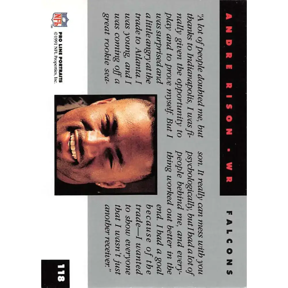
1991 Pro Line Portraits #118 Andre Rison EX-NM Atlanta Falcons Football Card

Skip to product information
1 of 2
Regular price $0.79 USD
Regular price Sale price $0.79 USD
Sold out

Enter your offer details

Seller Description

Own a piece of football history with the 1991 Pro Line Portraits #118 Andre Rison EX-NM Atlanta Falcons Football Card. This card features a stunning portrait of the legendary wide receiver, Andre Rison, in his Atlanta Falcons uniform. Rison was a dynamic player known for his speed, agility, and hands, making him a force to be reckoned with on the field.

This card is in excellent to near-mint condition, making it a valuable addition to any football card collection. Whether you're a die-hard Falcons fan or a football card collector, this card is sure to be a prized possession. The Pro Line Portraits series is highly sought after among collectors, and this card is no exception.

Andre Rison had an impressive career in the NFL, playing for several teams including the Falcons, Colts, Browns, Jaguars, Packers, and Chiefs. He was a five-time Pro Bowl selection and won a Super Bowl with the Green Bay Packers. Rison was known for his flashy playing style and his ability to make big plays when it mattered most.

Whether you're looking to add to your football card collection or simply want to own a piece of football history, the 1991 Pro Line Portraits #118 Andre Rison EX-NM Atlanta Falcons Football Card is a must-have. Don't miss out on the opportunity to own this rare and valuable card today.

Seller Policy

FILE 2: PRODUCT THREE COLUMN CSS ====================================================================== /* * Marketplace Product Page - Full Replacement Layout * Desktop: gallery + unified purchase panel * Tablet: balanced two-column layout, then single-column below 900px * Mobile: conversion-first single-column flow */ .marketplace-product-shell, .marketplace-product-shell * { box-sizing: border-box; } .marketplace-product-shell { --mp-border: rgba(var(--color-foreground), 0.14); --mp-border-strong: rgba(var(--color-foreground), 0.22); --mp-surface: rgb(var(--color-background)); --mp-muted: rgba(var(--color-foreground), 0.68); --mp-radius: 14px; --mp-radius-small: 10px; --mp-shadow: 0 12px 32px rgba(0, 0, 0, 0.07); --mp-gap: clamp(1.6rem, 2.2vw, 3.2rem); display: grid !important; grid-template-columns: minmax(0, 1.35fr) minmax(360px, 0.9fr) !important; gap: var(--mp-gap) !important; align-items: start !important; width: 100% !important; max-width: 100% !important; margin: 2rem 0 3rem !important; } .marketplace-product-shell > .product__media-wrapper, .marketplace-product-shell > .product__info-wrapper { width: 100% !important; min-width: 0 !important; max-width: none !important; margin: 0 !important; } /* Gallery card */ .marketplace-product-shell > .product__media-wrapper { grid-column: 1; padding: clamp(1rem, 1.8vw, 2rem) !important; background: var(--mp-surface); border: 2px solid #c9a84c; border-radius: var(--mp-radius); box-shadow: var(--mp-shadow); overflow: hidden; } .marketplace-product-shell .product__media-wrapper media-gallery, .marketplace-product-shell .product__media-wrapper slider-component, .marketplace-product-shell .product__media-wrapper .product__media-list { width: 100% !important; max-width: 100% !important; min-width: 0 !important; } .marketplace-product-shell .product__media-wrapper .product__media-item, .marketplace-product-shell .product__media-wrapper .product-media-container, .marketplace-product-shell .product__media-wrapper .product__media { max-width: 100% !important; } .marketplace-product-shell .product__media-wrapper img, .marketplace-product-shell .product__media-wrapper video, .marketplace-product-shell .product__media-wrapper iframe, .marketplace-product-shell .product__media-wrapper model-viewer { max-width: 100% !important; } .marketplace-product-shell .product__media-wrapper img { width: 100% !important; height: auto !important; max-height: min(72vh, 760px) !important; object-fit: contain !important; } .marketplace-product-shell .product-media-container, .marketplace-product-shell .product__media { display: flex !important; align-items: center; justify-content: center; min-height: 0 !important; overflow: hidden; border-radius: var(--mp-radius-small); } .marketplace-product-shell .thumbnail-list { gap: 0.8rem; } .marketplace-product-shell .thumbnail { border-radius: 8px; overflow: hidden; } .marketplace-product-shell .slider-buttons { display: flex !important; align-items: center; justify-content: center; gap: 0.8rem; margin-top: 1rem; } .marketplace-product-shell .slider-counter { display: flex !important; align-items: center; justify-content: center; min-width: 5rem; font-weight: 700; } /* Unified right-side purchase panel */ .marketplace-product-shell > .product__info-wrapper { grid-column: 2; padding: 0 !important; background: transparent !important; border: 0 !important; overflow: visible !important; } .marketplace-product-shell .marketplace-purchase-card { width: 100%; min-width: 0; padding: clamp(1.4rem, 2vw, 2.4rem); background: var(--mp-surface); border: 2px solid #c9a84c; border-radius: var(--mp-radius); box-shadow: var(--mp-shadow); } @media screen and (min-width: 1200px) { .marketplace-product-shell .marketplace-purchase-card { position: sticky; top: 2rem; } } /* Conditional auction and seller credentials */ .marketplace-dynamic-panel[hidden], .marketplace-auction-section[hidden], .marketplace-credentials-section[hidden] { display: none !important; } .marketplace-product-shell .marketplace-dynamic-panel { display: none; width: 100%; min-width: 0; max-width: 100%; margin: 0 0 1.6rem; padding: 1.2rem; background: rgba(var(--color-foreground), 0.025); border: 1px solid var(--mp-border); border-radius: var(--mp-radius-small); overflow: hidden; } .marketplace-product-shell .marketplace-dynamic-panel.is-visible { display: block; } .marketplace-product-shell .marketplace-auction-section, .marketplace-product-shell .marketplace-credentials-section { width: 100%; min-width: 0; max-width: 100%; } .marketplace-product-shell .marketplace-dynamic-panel.has-both .marketplace-credentials-section { margin-top: 1.2rem !important; padding-top: 1.2rem; border-top: 1px solid var(--mp-border); } .marketplace-product-shell .marketplace-dynamic-panel:not(.has-auction) .marketplace-credentials-section { margin-top: 0 !important; padding-top: 0; border-top: 0; } .marketplace-product-shell .marketplace-dynamic-panel #wk-auction, .marketplace-product-shell .marketplace-dynamic-panel #wk-auction > *, .marketplace-product-shell .marketplace-dynamic-panel .wk_seller_badge_div { width: 100% !important; max-width: 100% !important; min-width: 0 !important; margin-left: 0 !important; box-sizing: border-box; } .marketplace-product-shell .marketplace-dynamic-panel #wk-auction * { max-width: 100%; box-sizing: border-box; overflow-wrap: anywhere; } .marketplace-product-shell .marketplace-dynamic-panel #wk-auction:empty, .marketplace-product-shell .marketplace-dynamic-panel .wk_seller_badge_div:empty { display: none !important; } .marketplace-product-shell .seller-badges-header { margin-bottom: 0.8rem; } .marketplace-product-shell .seller-badges-title { margin: 0; font-size: 1.4rem; line-height: 1.3; } .marketplace-product-shell .wk_seller_badge_div { display: flex; flex-wrap: wrap; gap: 0.7rem; align-items: center; } .marketplace-product-shell .wk_seller_badge_div img { width: auto; max-width: 64px; height: auto; max-height: 48px; object-fit: contain; } /* Seller identity */ .marketplace-product-shell .product__seller-info-top { display: grid; grid-template-columns: auto minmax(0, 1fr); gap: 1rem; align-items: center; width: 100%; margin: 0 0 1.4rem !important; padding: 0 0 1.4rem !important; border-bottom: 1px solid var(--mp-border); } .marketplace-product-shell .product__seller-info-top .wk_seller_store_logo, .marketplace-product-shell .product__seller-info-top .wk_seller_detail { width: auto; min-width: 0; margin: 0 !important; text-align: left !important; } .marketplace-product-shell .product__seller-info-top .wk_seller_store_logo img { display: block; width: auto; max-width: 110px; height: auto; max-height: 56px; object-fit: contain; } .marketplace-product-shell .wk_seller_info { width: 100%; margin: 0 0 1.2rem !important; } /* Product information and forms */ .marketplace-product-shell .product__info-container, .marketplace-product-shell .product__info-container > *, .marketplace-product-shell .product-form, .marketplace-product-shell .product-form__input, .marketplace-product-shell .product-form__buttons, .marketplace-product-shell .shopify-payment-button, .marketplace-product-shell .shopify-payment-button__button { width: 100%; max-width: 100%; min-width: 0; } .marketplace-product-shell .product__info-container > * + * { margin-top: 1.2rem; } .marketplace-product-shell .price, .marketplace-product-shell .price--large { line-height: 1.15; } .marketplace-product-shell .main-price-quantity { display: grid; grid-template-columns: minmax(0, 1fr) auto; gap: 1.2rem; align-items: end; width: 100%; } .marketplace-product-shell .cus_price_block { min-width: 0; } .marketplace-product-shell .product-form__quantity { margin: 0; } .marketplace-product-shell button, .marketplace-product-shell .button, .marketplace-product-shell input[type="button"], .marketplace-product-shell input[type="submit"], .marketplace-product-shell select, .marketplace-product-shell input[type="text"], .marketplace-product-shell input[type="number"] { max-width: 100%; } .marketplace-product-shell .product-form__buttons button, .marketplace-product-shell .product-form__buttons .button, .marketplace-product-shell .product-form__buttons input[type="button"], .marketplace-product-shell .product-form__buttons input[type="submit"], .marketplace-product-shell .product-form__buttons a, .marketplace-product-shell #wk_make_an_offer_btn, .marketplace-product-shell #wk-askme button, .marketplace-product-shell #wk-askme a, .marketplace-product-shell .custom-share-button, .marketplace-product-shell .shopify-payment-button__button { width: 100% !important; max-width: 100% !important; min-width: 0 !important; min-height: 48px; margin-left: 0 !important; margin-right: 0 !important; white-space: normal !important; text-overflow: clip !important; } .marketplace-product-shell .product-form__buttons > *, .marketplace-product-shell #wk_make_an_offer, .marketplace-product-shell #wk-askme, .marketplace-product-shell #make_an_offer_btn_div { width: 100% !important; max-width: 100% !important; min-width: 0 !important; margin-left: 0 !important; margin-right: 0 !important; } .marketplace-product-shell table { width: 100% !important; max-width: 100%; table-layout: auto; } .marketplace-product-shell iframe, .marketplace-product-shell video, .marketplace-product-shell svg, .marketplace-product-shell img { max-width: 100%; } /* ========================================================== HORIZONTAL OVERFLOW PROTECTION Keeps app widgets, sliders, and injected content inside the page. ========================================================== */ [id^="MainProduct-"] { width: 100%; max-width: 100%; overflow-x: hidden; overflow-x: clip; } [id^="MainProduct-"] .page-width, [id^="MainProduct-"] .marketplace-product-shell, [id^="MainProduct-"] .marketplace-product-shell > *, [id^="MainProduct-"] .marketplace-purchase-card, [id^="MainProduct-"] media-gallery, [id^="MainProduct-"] slider-component, [id^="MainProduct-"] product-info, [id^="MainProduct-"] .product__media-list, [id^="MainProduct-"] .product__info-container, [id^="MainProduct-"] #wk-auction, [id^="MainProduct-"] [class*="wk_"], [id^="MainProduct-"] [id*="wk-"] { min-width: 0 !important; max-width: 100% !important; } [id^="MainProduct-"] img, [id^="MainProduct-"] video, [id^="MainProduct-"] iframe, [id^="MainProduct-"] svg, [id^="MainProduct-"] table, [id^="MainProduct-"] input, [id^="MainProduct-"] select, [id^="MainProduct-"] textarea, [id^="MainProduct-"] button { max-width: 100%; } [id^="MainProduct-"] table { width: 100%; } [id^="MainProduct-"] iframe { width: 100%; } /* ========================================================== MARKETPLACE TRUST BANNER ========================================================== */ .mp-trust-banner, .mp-trust-banner * { box-sizing: border-box; } .mp-trust-banner { width: 100%; max-width: 100%; margin: 0 0 1.8rem; color: rgb(var(--color-foreground)); overflow: hidden; border: 1px solid rgba(var(--color-foreground), 0.14); border-radius: 14px; background: rgb(var(--color-background)); box-shadow: 0 6px 20px rgba(0, 0, 0, 0.045); } .mp-trust-banner__inner { display: grid; grid-template-columns: minmax(160px, 0.8fr) minmax(0, 2.2fr) minmax(200px, 1fr); align-items: stretch; width: 100%; max-width: 100%; min-width: 0; } .mp-trust-banner__heading, .mp-trust-banner__ctca { display: flex; align-items: center; min-width: 0; padding: 1.2rem 1.4rem; } .mp-trust-banner__heading { gap: 0.75rem; font-size: 1.35rem; font-weight: 750; line-height: 1.2; background: rgba(23, 107, 69, 0.055); } .mp-trust-banner__heading-icon, .mp-trust-benefit__icon { display: inline-flex; flex: 0 0 auto; align-items: center; justify-content: center; color: #176b45; } .mp-trust-banner__benefits { display: grid; grid-template-columns: repeat(3, minmax(0, 1fr)); align-items: stretch; min-width: 0; border-left: 1px solid rgba(var(--color-foreground), 0.12); border-right: 1px solid rgba(var(--color-foreground), 0.12); } .mp-trust-benefit { display: flex; align-items: center; justify-content: center; gap: 0.75rem; min-width: 0; padding: 1rem 1.1rem; } .mp-trust-benefit + .mp-trust-benefit { border-left: 1px solid rgba(var(--color-foreground), 0.1); } .mp-trust-benefit__icon { width: 34px; height: 34px; border-radius: 50%; background: rgba(23, 107, 69, 0.08); } .mp-trust-benefit__text, .mp-trust-banner__ctca-text { display: block; min-width: 0; line-height: 1.2; } .mp-trust-benefit__text strong, .mp-trust-benefit__text small, .mp-trust-banner__ctca-text strong, .mp-trust-banner__ctca-text small { display: block; overflow-wrap: anywhere; } .mp-trust-benefit__text strong, .mp-trust-banner__ctca-text strong { font-size: 1.25rem; } .mp-trust-benefit__text small, .mp-trust-banner__ctca-text small { margin-top: 0.2rem; color: rgba(var(--color-foreground), 0.65); font-size: 1.05rem; } .mp-trust-banner__ctca { gap: 0.8rem; } .mp-trust-banner__ctca-image { flex: 0 0 auto; width: 46px; height: 46px; object-fit: contain; } @media screen and (max-width: 1099px) { .mp-trust-banner__inner { grid-template-columns: minmax(150px, 0.8fr) minmax(0, 2fr); } .mp-trust-banner__ctca { grid-column: 1 / -1; justify-content: center; padding: 0.9rem 1.2rem; border-top: 1px solid rgba(var(--color-foreground), 0.1); } } @media screen and (max-width: 749px) { .mp-trust-banner { margin-bottom: 1.2rem; border-radius: 12px; } .mp-trust-banner__inner { display: block; } .mp-trust-banner__heading { justify-content: center; padding: 0.9rem 1rem; font-size: 1.25rem; } .mp-trust-banner__benefits { grid-template-columns: repeat(3, minmax(0, 1fr)); border: 0; border-top: 1px solid rgba(var(--color-foreground), 0.1); } .mp-trust-benefit { flex-direction: column; justify-content: flex-start; gap: 0.45rem; padding: 0.9rem 0.45rem; text-align: center; } .mp-trust-benefit__icon { width: 30px; height: 30px; } .mp-trust-benefit__text strong { font-size: 1.05rem; } .mp-trust-benefit__text small { display: none; } .mp-trust-banner__ctca { justify-content: center; padding: 0.8rem 1rem; } .mp-trust-banner__ctca-image { width: 38px; height: 38px; } .mp-trust-banner__ctca-text strong { font-size: 1.1rem; } .mp-trust-banner__ctca-text small { font-size: 0.95rem; } } @media screen and (max-width: 390px) { .mp-trust-benefit__text strong { font-size: 0.95rem; } } /* Unified description and policy box */ .seller-info-unified-wrapper { width: 100%; max-width: none; margin: 2rem 0; padding: 0; } .seller-info-unified-box { background: linear-gradient(135deg, #ffffff 0%, #f8fafc 100%); border: 2px solid #c9a84c; border-radius: 20px; padding: 1.25rem 2rem; box-shadow: 0 8px 24px rgba(0, 0, 0, 0.08), 0 2px 8px rgba(0, 0, 0, 0.04); transition: all 0.3s cubic-bezier(0.4, 0, 0.2, 1); position: relative; overflow: hidden; } .seller-info-unified-box::before { content: ''; position: absolute; top: 0; left: 0; right: 0; height: 4px; background: linear-gradient(90deg, #c9a84c, #d4b560, #c9a84c); opacity: 0; transition: opacity 0.3s ease; } .seller-info-unified-box:hover::before { opacity: 1; } .seller-info-unified-box:hover { transform: translateY(-2px); box-shadow: 0 12px 32px rgba(0, 0, 0, 0.12), 0 4px 12px rgba(0, 0, 0, 0.06); border-color: #d4b560; } .seller-info-section { padding: 1.5rem 0; } .seller-info-section:first-child { padding-top: 0; } .seller-info-section:last-child { padding-bottom: 0; } .seller-info-header { display: flex; align-items: center; gap: 0.8rem; margin-bottom: 1rem; padding-bottom: 0.75rem; border-bottom: 2px solid #e2e8f0; } .seller-info-title { margin: 0; font-size: 1.25rem; font-weight: 700; color: #1e293b; letter-spacing: -0.02em; } .seller-info-icon { flex-shrink: 0; width: 36px; height: 36px; border-radius: 10px; background: linear-gradient(135deg, #c9a84c, #b8963d); display: flex; align-items: center; justify-content: center; color: white; box-shadow: 0 4px 12px rgba(201, 168, 76, 0.3); padding: 6px; } .seller-info-icon svg { width: 100%; height: 100%; } .seller-info-separator { height: 2px; background: #e2e8f0; margin: 1.5rem 0; } /* Mobile styles for seller info unified box */ @media screen and (max-width: 749px) { .seller-info-unified-box { padding: 1.25rem 1.5rem; border-radius: 16px; } .seller-info-section { padding: 1.25rem 0; } .seller-info-header { gap: 0.6rem; margin-bottom: 0.75rem; } .seller-info-title { font-size: 1.125rem; } .seller-info-icon { width: 32px; height: 32px; } .seller-info-separator { margin: 1.25rem 0; } } @media (prefers-reduced-motion: reduce) { .seller-info-unified-box { animation: none !important; transition: none !important; } .seller-info-unified-box:hover { transform: none; } } /* Tablet */ @media screen and (max-width: 1099px) { .marketplace-product-shell { grid-template-columns: minmax(0, 1.1fr) minmax(320px, 0.9fr) !important; gap: 1.8rem !important; } .marketplace-product-shell .marketplace-purchase-card { padding: 1.4rem; } .marketplace-product-shell .main-price-quantity { grid-template-columns: 1fr; align-items: start; } } /* Small tablet and mobile: conversion-first single column */ @media screen and (max-width: 899px) { .marketplace-product-shell { display: flex !important; flex-direction: column; gap: 1.5rem !important; margin-top: 1.5rem !important; } .marketplace-product-shell > .product__media-wrapper { order: 1; } .marketplace-product-shell > .product__info-wrapper { order: 2; } .marketplace-product-shell .marketplace-purchase-card { position: static; } .marketplace-product-shell .product__media-wrapper img { max-height: 620px !important; } } /* Phone */ @media screen and (max-width: 749px) { .section-main-product .page-width { padding-left: 1.2rem; padding-right: 1.2rem; } .marketplace-product-shell { gap: 1.2rem !important; margin: 1rem 0 2rem !important; } .marketplace-product-shell > .product__media-wrapper, .marketplace-product-shell .marketplace-purchase-card { border-radius: 12px; } .marketplace-product-shell > .product__media-wrapper { padding: 0.8rem !important; } .marketplace-product-shell .marketplace-purchase-card { padding: 1.2rem; } .marketplace-product-shell .product__media-list.slider, .marketplace-product-shell .product__media-list.slider--mobile { display: flex !important; overflow-x: auto !important; scroll-snap-type: x mandatory; scroll-behavior: smooth; gap: 0 !important; } .marketplace-product-shell .product__media-item, .marketplace-product-shell .product__media-item.grid__item, .marketplace-product-shell .slider__slide { flex: 0 0 100% !important; width: 100% !important; max-width: 100% !important; min-width: 100% !important; scroll-snap-align: start; } .marketplace-product-shell .product__media-wrapper img { max-height: 72vh !important; } .marketplace-product-shell .thumbnail-list { display: none !important; } .marketplace-product-shell .slider-buttons { margin-top: 0.7rem; } .marketplace-product-shell .marketplace-dynamic-panel { padding: 1rem; } .marketplace-product-shell .product__seller-info-top { grid-template-columns: 72px minmax(0, 1fr); } .marketplace-product-shell .product__seller-info-top .wk_seller_store_logo img { max-width: 72px; max-height: 48px; } .marketplace-product-shell .wk_seller_badge_div { flex-wrap: nowrap; overflow-x: auto; padding-bottom: 0.4rem; scroll-snap-type: x proximity; } .marketplace-product-shell .wk_seller_badge_div > * { flex: 0 0 auto; scroll-snap-align: start; } .marketplace-product-shell .product-form__buttons button, .marketplace-product-shell .product-form__buttons .button, .marketplace-product-shell .product-form__buttons input[type="button"], .marketplace-product-shell .product-form__buttons input[type="submit"], .marketplace-product-shell .product-form__buttons a, .marketplace-product-shell .shopify-payment-button__button { min-height: 50px; font-size: 1.5rem; line-height: 1.25; } .seller-info-section { padding: 1.4rem; } .wk-mvm-shipping-days-div select, .wk-mvm-shipping-days-div input, .wk-mvm-shipping-days-div button { width: 100% !important; } } /* Narrow phone */ @media screen and (max-width: 420px) { .marketplace-product-shell .product__seller-info-top { grid-template-columns: 1fr; } .marketplace-product-shell .product__seller-info-top .wk_seller_store_logo img { max-width: 100px; } } /* Final defensive containment for injected marketplace/app content */ @media screen and (max-width: 899px) { [id^="MainProduct-"] .marketplace-product-shell, [id^="MainProduct-"] .product__media-wrapper, [id^="MainProduct-"] .product__info-wrapper, [id^="MainProduct-"] .marketplace-purchase-card { width: 100% !important; max-width: 100% !important; min-width: 0 !important; } [id^="MainProduct-"] .product__media-list.slider, [id^="MainProduct-"] .product__media-list.slider--mobile { width: 100% !important; max-width: 100% !important; margin-left: 0 !important; margin-right: 0 !important; padding-left: 0 !important; padding-right: 0 !important; } [id^="MainProduct-"] .product__media-item, [id^="MainProduct-"] .slider__slide { max-width: 100% !important; } } /* ========================================================== DEFINITIVE FINAL FIX — cards, gallery controls, actions, share behavior, and horizontal overflow. ========================================================== */ html, body { max-width: 100%; overflow-x: clip; } [id^="MainProduct-"] { width: 100%; max-width: 100%; overflow-x: clip !important; } [id^="MainProduct-"] .page-width, [id^="MainProduct-"] .marketplace-product-shell, [id^="MainProduct-"] .marketplace-product-shell > *, [id^="MainProduct-"] .marketplace-card, [id^="MainProduct-"] .marketplace-info-card__inner, [id^="MainProduct-"] .marketplace-purchase-card, [id^="MainProduct-"] media-gallery, [id^="MainProduct-"] slider-component, [id^="MainProduct-"] product-info { min-width: 0 !important; max-width: 100% !important; box-sizing: border-box !important; } /* Identical outer card treatment for the two columns. */ .marketplace-product-shell { align-items: stretch !important; } .marketplace-product-shell > .marketplace-card { width: 100% !important; min-width: 0 !important; max-width: 100% !important; height: 100% !important; margin: 0 !important; padding: clamp(1.4rem, 2vw, 2.4rem) !important; border: 1px solid var(--mp-border) !important; border-radius: var(--mp-radius) !important; background: var(--mp-surface) !important; box-shadow: var(--mp-shadow) !important; overflow: hidden !important; } .marketplace-product-shell > .marketplace-info-card, .marketplace-product-shell .marketplace-info-card__inner, .marketplace-product-shell .marketplace-purchase-card { display: flex !important; flex-direction: column !important; width: 100% !important; min-width: 0 !important; } .marketplace-product-shell .marketplace-info-card__inner, .marketplace-product-shell .marketplace-purchase-card { flex: 1 1 auto !important; } /* Outer right column is the card; remove the nested card appearance. */ .marketplace-product-shell .marketplace-purchase-card { height: 100% !important; padding: 0 !important; border: 0 !important; border-radius: 0 !important; background: transparent !important; box-shadow: none !important; position: static !important; top: auto !important; overflow: visible !important; } /* Gallery: clip media only, never the controls/counter. */ .marketplace-product-shell .marketplace-media-card { display: flex !important; flex-direction: column !important; } .marketplace-product-shell .marketplace-media-card media-gallery, .marketplace-product-shell .marketplace-media-card slider-component { display: flex !important; flex: 1 1 auto !important; flex-direction: column !important; width: 100% !important; min-width: 0 !important; overflow: visible !important; } .marketplace-product-shell .marketplace-media-card .product__media-list { width: 100% !important; min-width: 0 !important; max-width: 100% !important; margin: 0 !important; } .marketplace-product-shell .marketplace-media-card .product__media-item, .marketplace-product-shell .marketplace-media-card .product-media-container, .marketplace-product-shell .marketplace-media-card .product__media { min-width: 0 !important; max-width: 100% !important; } .marketplace-product-shell .marketplace-media-card .slider-buttons { position: relative !important; z-index: 10 !important; display: flex !important; flex: 0 0 auto !important; align-items: center !important; justify-content: center !important; gap: 10px !important; width: 100% !important; min-height: 48px !important; margin: 12px 0 0 !important; padding: 2px 0 !important; overflow: visible !important; } .marketplace-product-shell .marketplace-media-card .slider-counter, .marketplace-product-shell .marketplace-media-card .slider-counter-below { position: static !important; display: flex !important; align-items: center !important; justify-content: center !important; width: auto !important; min-width: 88px !important; max-width: none !important; height: 38px !important; min-height: 38px !important; margin: 0 !important; padding: 0 12px !important; overflow: visible !important; visibility: visible !important; opacity: 1 !important; white-space: nowrap !important; line-height: 1 !important; font-size: 14px !important; font-weight: 700 !important; } .marketplace-product-shell .marketplace-media-card .slider-button { flex: 0 0 44px !important; width: 44px !important; min-width: 44px !important; height: 44px !important; margin: 0 !important; } /* Permanently suppress all legacy expanding Share interfaces. */ .marketplace-product-shell share-button, .marketplace-product-shell .share-button, .marketplace-product-shell .product__share, .marketplace-product-shell .custom-share-button-wrapper, .marketplace-product-shell .share-button__fallback, .marketplace-product-shell details[class*="share" i] { display: none !important; width: 0 !important; height: 0 !important; min-height: 0 !important; margin: 0 !important; padding: 0 !important; border: 0 !important; overflow: hidden !important; } /* One predictable full-width action stack. */ .marketplace-product-shell .product-form__buttons { --mp-action-gap: 10px; display: flex !important; flex-direction: column !important; align-items: stretch !important; gap: var(--mp-action-gap) !important; width: 100% !important; min-width: 0 !important; max-width: 100% !important; margin: 0 !important; padding: 0 !important; } .marketplace-product-shell .product-form__buttons > *, .marketplace-product-shell #wk_make_an_offer, .marketplace-product-shell #make_an_offer_btn_div, .marketplace-product-shell #wk-askme, .marketplace-product-shell .custom_dynamic_btns { width: 100% !important; min-width: 0 !important; max-width: 100% !important; margin: 0 !important; padding-left: 0 !important; padding-right: 0 !important; float: none !important; align-self: stretch !important; } .marketplace-product-shell .marketplace-action-is-empty, .marketplace-product-shell [hidden] { display: none !important; margin: 0 !important; padding: 0 !important; } .marketplace-product-shell .product-form__submit, .marketplace-product-shell .product-form__buttons button, .marketplace-product-shell .product-form__buttons a.button, .marketplace-product-shell .product-form__buttons input[type="button"], .marketplace-product-shell .product-form__buttons input[type="submit"], .marketplace-product-shell #wk_make_an_offer_btn, .marketplace-product-shell #wk_make_an_offer button, .marketplace-product-shell #wk_make_an_offer input, .marketplace-product-shell #wk-askme a, .marketplace-product-shell #wk-askme button, .marketplace-product-shell .wk-ask-a-question, .marketplace-product-shell .marketplace-native-share-button, .marketplace-product-shell .shopify-payment-button__button { display: flex !important; align-items: center !important; justify-content: center !important; width: 100% !important; min-width: 0 !important; max-width: 100% !important; min-height: 52px !important; height: auto !important; margin: 0 !important; padding: 12px 16px !important; float: none !important; box-sizing: border-box !important; border-radius: 10px !important; font-family: inherit !important; font-size: 15px !important; font-weight: 700 !important; line-height: 1.2 !important; text-align: center !important; text-decoration: none !important; white-space: normal !important; } /* Text-only controls. */ .marketplace-product-shell .product-form__buttons :is(svg, img, picture, .icon, [class*="icon" i], [class*="heart" i]), .marketplace-product-shell #wk_make_an_offer :is(svg, img, .icon), .marketplace-product-shell #wk-askme :is(svg, img, .icon) { display: none !important; } .marketplace-product-shell .product-form__submit, .marketplace-product-shell button[name="add"], .marketplace-product-shell .shopify-payment-button__button--unbranded { color: #fff !important; background: #0e5a3b !important; border: 1px solid #0e5a3b !important; box-shadow: none !important; } .marketplace-product-shell .product-form__submit:hover, .marketplace-product-shell button[name="add"]:hover, .marketplace-product-shell .shopify-payment-button__button--unbranded:hover { background: #0b4a30 !important; border-color: #0b4a30 !important; } .marketplace-product-shell #wk_make_an_offer_btn, .marketplace-product-shell #wk_make_an_offer button, .marketplace-product-shell #wk_make_an_offer input, .marketplace-product-shell #wk-askme a, .marketplace-product-shell #wk-askme button, .marketplace-product-shell .wk-ask-a-question, .marketplace-product-shell .marketplace-native-share-button { color: #172033 !important; background: #fff !important; border: 1px solid #cbd5e1 !important; box-shadow: none !important; } .marketplace-product-shell .marketplace-native-share-button { background: #f3f5f7 !important; cursor: pointer !important; } /* App content can never widen the page. */ .marketplace-product-shell #wk-auction, .marketplace-product-shell #wk-auction *, .marketplace-product-shell [class*="wk_"], .marketplace-product-shell [id*="wk-"], .marketplace-product-shell table, .marketplace-product-shell iframe, .marketplace-product-shell video, .marketplace-product-shell img, .marketplace-product-shell svg, .marketplace-product-shell input, .marketplace-product-shell select, .marketplace-product-shell textarea, .marketplace-product-shell button { max-width: 100% !important; box-sizing: border-box !important; } .marketplace-product-shell table, .marketplace-product-shell iframe { width: 100% !important; } @media screen and (max-width: 899px) { .marketplace-product-shell { align-items: stretch !important; } .marketplace-product-shell > .marketplace-card, .marketplace-product-shell .marketplace-info-card__inner, .marketplace-product-shell .marketplace-purchase-card { height: auto !important; min-height: 0 !important; } } @media screen and (max-width: 749px) { .marketplace-product-shell > .marketplace-card { padding: 12px !important; border-radius: 12px !important; } .marketplace-product-shell .product__media-list.slider, .marketplace-product-shell .product__media-list.slider--mobile { width: 100% !important; max-width: 100% !important; margin: 0 !important; padding: 0 !important; overflow-x: auto !important; overflow-y: hidden !important; overscroll-behavior-x: contain; scrollbar-width: none; } .marketplace-product-shell .product__media-list.slider::-webkit-scrollbar, .marketplace-product-shell .product__media-list.slider--mobile::-webkit-scrollbar { display: none; } .marketplace-product-shell .product__media-item, .marketplace-product-shell .slider__slide { flex: 0 0 100% !important; width: 100% !important; min-width: 100% !important; max-width: 100% !important; } } /* ========================================================== FINAL STABILITY PATCH - v2 Keep this block at the absolute end of this stylesheet. ========================================================== */ html, body { width: 100% !important; max-width: 100% !important; overflow-x: hidden !important; } [id^="MainProduct-"] .page-width { width: 100% !important; max-width: 100% !important; overflow-x: clip !important; } /* Both desktop columns are the same physical card. */ @media screen and (min-width: 900px) { .marketplace-product-shell { grid-auto-rows: 1fr !important; align-items: stretch !important; } .marketplace-product-shell > .marketplace-card { height: 100% !important; min-height: 100% !important; padding: clamp(1.4rem, 2vw, 2.4rem) !important; border: 1px solid var(--mp-border) !important; border-radius: var(--mp-radius) !important; background: var(--mp-surface) !important; box-shadow: var(--mp-shadow) !important; } .marketplace-product-shell > .marketplace-info-card, .marketplace-product-shell .marketplace-info-card__inner, .marketplace-product-shell .marketplace-purchase-card { height: 100% !important; } } /* Do not let the gallery viewport clip its controls or counter. */ .marketplace-product-shell .marketplace-media-card { overflow: visible !important; } .marketplace-product-shell .marketplace-media-card media-gallery, .marketplace-product-shell .marketplace-media-card slider-component { height: auto !important; min-height: 0 !important; overflow: visible !important; padding-bottom: 2px !important; } .marketplace-product-shell .marketplace-media-card .product__media-list { overflow: hidden !important; } .marketplace-product-shell .marketplace-media-card .slider-buttons { position: relative !important; inset: auto !important; display: flex !important; width: 100% !important; min-height: 52px !important; margin: 12px 0 0 !important; padding: 4px 0 !important; overflow: visible !important; } .marketplace-product-shell .marketplace-media-card .slider-buttons .slider-counter { display: flex !important; position: static !important; width: auto !important; min-width: 90px !important; height: 40px !important; min-height: 40px !important; padding: 0 12px !important; overflow: visible !important; white-space: nowrap !important; line-height: 40px !important; } /* Prevent a second counter from overlapping or being clipped. */ .marketplace-product-shell .marketplace-media-card .slider-counter-below { display: none !important; } /* Dawn/Webkul expanding Share UI must never render. */ [id^="MainProduct-"] share-button, [id^="MainProduct-"] .share-button, [id^="MainProduct-"] .product__share, [id^="MainProduct-"] .custom-share-button-wrapper, [id^="MainProduct-"] .share-button__fallback, [id^="MainProduct-"] details[class*="share" i] { display: none !important; visibility: hidden !important; width: 0 !important; min-width: 0 !important; max-width: 0 !important; height: 0 !important; min-height: 0 !important; margin: 0 !important; padding: 0 !important; border: 0 !important; overflow: hidden !important; pointer-events: none !important; } /* The only Share control allowed. */ [id^="MainProduct-"] .marketplace-native-share-button { display: flex !important; align-items: center !important; justify-content: center !important; width: 100% !important; min-width: 0 !important; max-width: 100% !important; min-height: 52px !important; margin: 10px 0 0 !important; padding: 12px 16px !important; border: 1px solid #cbd5e1 !important; border-radius: 10px !important; color: #172033 !important; background: #f3f5f7 !important; box-shadow: none !important; font-family: inherit !important; font-size: 15px !important; font-weight: 700 !important; line-height: 1.2 !important; text-align: center !important; cursor: pointer !important; } /* Defensive containment without creating a second page scrollbar. */ [id^="MainProduct-"] .marketplace-product-shell, [id^="MainProduct-"] .marketplace-product-shell > *, [id^="MainProduct-"] .marketplace-card, [id^="MainProduct-"] .marketplace-info-card__inner, [id^="MainProduct-"] .marketplace-purchase-card, [id^="MainProduct-"] media-gallery, [id^="MainProduct-"] slider-component, [id^="MainProduct-"] product-info, [id^="MainProduct-"] #wk-auction, [id^="MainProduct-"] [class*="wk_"], [id^="MainProduct-"] [id*="wk-"] { min-width: 0 !important; max-width: 100% !important; box-sizing: border-box !important; } @media screen and (max-width: 899px) { .marketplace-product-shell > .marketplace-card, .marketplace-product-shell .marketplace-info-card__inner, .marketplace-product-shell .marketplace-purchase-card { height: auto !important; min-height: 0 !important; } } @media screen and (max-width: 749px) { .marketplace-product-shell .marketplace-media-card { overflow: hidden !important; } .marketplace-product-shell .marketplace-media-card .product__media-list.slider, .marketplace-product-shell .marketplace-media-card .product__media-list.slider--mobile { overflow-x: auto !important; overflow-y: hidden !important; overscroll-behavior-x: contain; max-width: 100% !important; } .marketplace-product-shell .marketplace-media-card .slider-buttons { overflow: visible !important; } } /* ========================================================== FINAL V3 PATCH: gallery arrows, one Share control, spacing, and stable action colors. Keep this block last. ========================================================== */ /* Restore the previous/next gallery controls at every viewport. */ [id^="MainProduct-"] .marketplace-media-card .slider-buttons { display: flex !important; visibility: visible !important; opacity: 1 !important; align-items: center !important; justify-content: center !important; gap: 10px !important; width: 100% !important; min-height: 54px !important; margin: 12px 0 0 !important; padding: 4px 0 !important; position: relative !important; z-index: 20 !important; overflow: visible !important; } [id^="MainProduct-"] .marketplace-media-card .slider-button, [id^="MainProduct-"] .marketplace-media-card button.slider-button { display: inline-flex !important; visibility: visible !important; opacity: 1 !important; align-items: center !important; justify-content: center !important; flex: 0 0 44px !important; width: 44px !important; min-width: 44px !important; max-width: 44px !important; height: 44px !important; min-height: 44px !important; margin: 0 !important; padding: 0 !important; border: 1px solid #cbd5e1 !important; border-radius: 50% !important; color: #172033 !important; background: #ffffff !important; box-shadow: none !important; pointer-events: auto !important; cursor: pointer !important; } [id^="MainProduct-"] .marketplace-media-card .slider-button svg { display: block !important; visibility: visible !important; width: 18px !important; height: 18px !important; max-width: 18px !important; max-height: 18px !important; color: currentColor !important; } [id^="MainProduct-"] .marketplace-media-card .slider-button[disabled] { display: inline-flex !important; opacity: 0.35 !important; cursor: default !important; } /* Remove every legacy Share presentation; only the native button remains. */ [id^="MainProduct-"] :is( share-button, .share-button, .product__share, .custom-share-button-wrapper, .share-button__fallback, details[class*="share" i], .custom-share-button:not(.marketplace-native-share-button) ) { display: none !important; visibility: hidden !important; width: 0 !important; height: 0 !important; min-height: 0 !important; margin: 0 !important; padding: 0 !important; overflow: hidden !important; pointer-events: none !important; } /* One action stack with reliable spacing, including app-injected actions. */ [id^="MainProduct-"] .product-form__buttons { display: flex !important; flex-direction: column !important; align-items: stretch !important; gap: 12px !important; width: 100% !important; margin: 0 !important; padding: 0 !important; } [id^="MainProduct-"] .product-form__buttons > * { width: 100% !important; min-width: 0 !important; max-width: 100% !important; margin: 0 !important; padding-left: 0 !important; padding-right: 0 !important; align-self: stretch !important; } /* Remove margins inside wrappers so the flex gap is the only spacing source. */ [id^="MainProduct-"] .product-form__buttons > * > :is(button, a, input[type="button"], input[type="submit"]), [id^="MainProduct-"] .product-form__buttons > :is(button, a, input[type="button"], input[type="submit"]) { margin-top: 0 !important; margin-bottom: 0 !important; } /* Lock geometry and colors so app/theme rules cannot change them again. */ [id^="MainProduct-"] .product-form__buttons :is( .product-form__submit, button, a.button, input[type="button"], input[type="submit"], .marketplace-native-share-button ) { width: 100% !important; min-width: 0 !important; max-width: 100% !important; min-height: 52px !important; margin: 0 !important; padding: 12px 16px !important; border-radius: 10px !important; box-sizing: border-box !important; font-family: inherit !important; font-size: 15px !important; font-weight: 700 !important; line-height: 1.2 !important; text-align: center !important; justify-content: center !important; } /* Primary purchase action. */ [id^="MainProduct-"] .product-form__buttons :is(.product-form__submit, button[name="add"]) { color: #ffffff !important; background: #0e5a3b !important; border: 1px solid #0e5a3b !important; } [id^="MainProduct-"] .product-form__buttons :is(.product-form__submit, button[name="add"]):hover { color: #ffffff !important; background: #0b4a30 !important; border-color: #0b4a30 !important; } /* All secondary actions, including Like, Message, Offer, and Share. */ [id^="MainProduct-"] .product-form__buttons :is( button:not([name="add"]):not(.product-form__submit), a.button, input[type="button"], input[type="submit"]:not([name="add"]), .marketplace-native-share-button ) { color: #172033 !important; background: #ffffff !important; border: 1px solid #cbd5e1 !important; box-shadow: none !important; } [id^="MainProduct-"] .product-form__buttons .marketplace-native-share-button { display: flex !important; visibility: visible !important; height: auto !important; min-height: 52px !important; cursor: pointer !important; } @media screen and (max-width: 749px) { [id^="MainProduct-"] .product-form__buttons { gap: 10px !important; } [id^="MainProduct-"] .marketplace-media-card .slider-buttons { min-height: 50px !important; margin-top: 8px !important; } [id^="MainProduct-"] .marketplace-media-card .slider-button, [id^="MainProduct-"] .marketplace-media-card button.slider-button { flex-basis: 42px !important; width: 42px !important; min-width: 42px !important; max-width: 42px !important; height: 42px !important; min-height: 42px !important; } } /* ========================================================== FINAL V4 ACTION RHYTHM + CONVERSION COLORS Keep this block last. It standardizes every visible action. ========================================================== */ [id^="MainProduct-"] .marketplace-purchase-card { --mp-final-action-gap: 14px; --mp-final-action-height: 54px; --mp-final-action-radius: 10px; } /* The action stack owns all spacing. No child may add its own margins. */ [id^="MainProduct-"] .product-form__buttons { display: grid !important; grid-template-columns: minmax(0, 1fr) !important; gap: var(--mp-final-action-gap) !important; width: 100% !important; max-width: 100% !important; margin: 0 !important; padding: 0 !important; } [id^="MainProduct-"] .product-form__buttons > *, [id^="MainProduct-"] .product-form__buttons > * > *, [id^="MainProduct-"] .product-form__buttons .shopify-payment-button, [id^="MainProduct-"] .product-form__buttons .shopify-payment-button__button, [id^="MainProduct-"] .product-form__buttons #wk_make_an_offer, [id^="MainProduct-"] .product-form__buttons #make_an_offer_btn_div, [id^="MainProduct-"] .product-form__buttons #wk-askme, [id^="MainProduct-"] .product-form__buttons .custom_dynamic_btns { width: 100% !important; min-width: 0 !important; max-width: 100% !important; margin: 0 !important; box-sizing: border-box !important; } /* Every visible customer action is exactly the Add to Cart size. */ [id^="MainProduct-"] .product-form__buttons :is( .product-form__submit, button, a.button, input[type="button"], input[type="submit"], .shopify-payment-button__button, .marketplace-native-share-button ) { display: flex !important; align-items: center !important; justify-content: center !important; width: 100% !important; min-width: 0 !important; max-width: 100% !important; height: var(--mp-final-action-height) !important; min-height: var(--mp-final-action-height) !important; max-height: var(--mp-final-action-height) !important; margin: 0 !important; padding: 0 18px !important; border-radius: var(--mp-final-action-radius) !important; box-sizing: border-box !important; font-family: inherit !important; font-size: 15px !important; font-weight: 750 !important; line-height: 1 !important; letter-spacing: 0.02em !important; text-align: center !important; text-decoration: none !important; white-space: nowrap !important; overflow: hidden !important; text-overflow: ellipsis !important; box-shadow: none !important; } /* Add to Cart: strongest conversion color. */ [id^="MainProduct-"] .product-form__buttons :is(.product-form__submit, button[name="add"]) { color: #ffffff !important; background: #0e5a3b !important; border: 1px solid #0e5a3b !important; } [id^="MainProduct-"] .product-form__buttons :is(.product-form__submit, button[name="add"]):hover { background: #0b4a30 !important; border-color: #0b4a30 !important; } /* Buy Now: visually strong, but distinct from Add to Cart. */ [id^="MainProduct-"] .product-form__buttons :is( .shopify-payment-button__button, .shopify-payment-button__button--unbranded ) { color: #ffffff !important; background: #111827 !important; border: 1px solid #111827 !important; } [id^="MainProduct-"] .product-form__buttons :is( .shopify-payment-button__button, .shopify-payment-button__button--unbranded ):hover { background: #030712 !important; border-color: #030712 !important; } /* Make an Offer: blue action color to encourage engagement. */ [id^="MainProduct-"] .product-form__buttons :is( #wk_make_an_offer_btn, #wk_make_an_offer button, #wk_make_an_offer input[type="button"], #wk_make_an_offer input[type="submit"] ) { color: #ffffff !important; background: #2563eb !important; border: 1px solid #2563eb !important; } [id^="MainProduct-"] .product-form__buttons :is( #wk_make_an_offer_btn, #wk_make_an_offer button, #wk_make_an_offer input[type="button"], #wk_make_an_offer input[type="submit"] ):hover { background: #1d4ed8 !important; border-color: #1d4ed8 !important; } /* Message Seller: clear secondary action. */ [id^="MainProduct-"] .product-form__buttons :is( #wk-askme a, #wk-askme button, .wk-ask-a-question ) { color: #1d4ed8 !important; background: #ffffff !important; border: 1px solid #93c5fd !important; } [id^="MainProduct-"] .product-form__buttons :is( #wk-askme a, #wk-askme button, .wk-ask-a-question ):hover { color: #1e40af !important; background: #eff6ff !important; border-color: #60a5fa !important; } /* Favorites/Like: warm but quieter than purchase actions. */ [id^="MainProduct-"] .product-form__buttons :is( button[id*="like" i], button[class*="like" i], a[id*="like" i], a[class*="like" i], button[id*="wishlist" i], button[class*="wishlist" i], a[id*="wishlist" i], a[class*="wishlist" i] ) { color: #9f1239 !important; background: #fff1f2 !important; border: 1px solid #fecdd3 !important; } /* Share: neutral utility action, uppercase label from Liquid. */ [id^="MainProduct-"] .product-form__buttons .marketplace-native-share-button { color: #334155 !important; background: #f8fafc !important; border: 1px solid #cbd5e1 !important; text-transform: uppercase !important; } [id^="MainProduct-"] .product-form__buttons .marketplace-native-share-button:hover { color: #0f172a !important; background: #f1f5f9 !important; border-color: #94a3b8 !important; } /* Hidden/missing optional actions contribute absolutely no gap or placeholder. */ [id^="MainProduct-"] .product-form__buttons > :is([hidden], .marketplace-action-is-empty, :empty) { display: none !important; margin: 0 !important; padding: 0 !important; height: 0 !important; min-height: 0 !important; border: 0 !important; } /* Disabled buttons stay the same physical size. */ [id^="MainProduct-"] .product-form__buttons :is(button, input, a)[disabled], [id^="MainProduct-"] .product-form__buttons :is(button, input, a)[aria-disabled="true"] { opacity: 0.55 !important; height: var(--mp-final-action-height) !important; min-height: var(--mp-final-action-height) !important; } /* Same dimensions and spacing on tablet and mobile. */ @media screen and (max-width: 1099px) { [id^="MainProduct-"] .marketplace-purchase-card { --mp-final-action-gap: 14px; --mp-final-action-height: 54px; } } /* ========================================================== V6 STABLE ACTION SPACING + SAFE GALLERY CONTAINMENT This block intentionally comes last. ========================================================== */ [id^="MainProduct-"] .marketplace-purchase-card { --mp-button-height: 54px; --mp-button-gap: 18px; --mp-button-radius: 10px; } /* One spacing system for all visible actions. */ [id^="MainProduct-"] .product-form__buttons { display: grid !important; grid-template-columns: minmax(0, 1fr) !important; row-gap: var(--mp-button-gap) !important; width: 100% !important; max-width: 100% !important; margin: 0 !important; padding: 0 !important; } /* Normalize only action wrappers. Do not alter unrelated app markup. */ [id^="MainProduct-"] .product-form__buttons > *, [id^="MainProduct-"] .product-form__buttons .shopify-payment-button, [id^="MainProduct-"] .product-form__buttons #wk_make_an_offer, [id^="MainProduct-"] .product-form__buttons #make_an_offer_btn_div, [id^="MainProduct-"] .product-form__buttons #wk-askme, [id^="MainProduct-"] .product-form__buttons .wk_like_btn, [id^="MainProduct-"] .product-form__buttons .custom_dynamic_btns { width: 100% !important; min-width: 0 !important; max-width: 100% !important; margin: 0 !important; padding: 0 !important; box-sizing: border-box !important; } /* Empty optional wrappers must not create a grid row. */ [id^="MainProduct-"] .product-form__buttons > [hidden], [id^="MainProduct-"] .product-form__buttons > :empty, [id^="MainProduct-"] .product-form__buttons > .marketplace-action-is-empty { display: none !important; } /* Identical geometry for every visible customer action. */ [id^="MainProduct-"] .product-form__buttons :is( .product-form__submit, button[name="add"], .shopify-payment-button__button, .shopify-payment-button__button--unbranded, #wk_make_an_offer_btn, #wk_make_an_offer button, #wk_make_an_offer input[type="button"], #wk_make_an_offer input[type="submit"], #wk-askme a, #wk-askme button, .wk-ask-a-question, .wk_like_btn a, button[id*="like" i], button[class*="like" i], a[id*="like" i], a[class*="like" i], button[id*="wishlist" i], button[class*="wishlist" i], a[id*="wishlist" i], a[class*="wishlist" i], .marketplace-native-share-button, .custom-share-button ) { display: flex !important; align-items: center !important; justify-content: center !important; width: 100% !important; min-width: 0 !important; max-width: 100% !important; height: var(--mp-button-height) !important; min-height: var(--mp-button-height) !important; max-height: var(--mp-button-height) !important; margin: 0 !important; padding: 0 18px !important; box-sizing: border-box !important; border-radius: var(--mp-button-radius) !important; font-family: inherit !important; font-size: 15px !important; font-weight: 700 !important; line-height: 1 !important; letter-spacing: .01em !important; text-align: center !important; text-decoration: none !important; white-space: normal !important; box-shadow: none !important; transform: none !important; } /* Remove decorative action icons without touching loading indicators. */ [id^="MainProduct-"] .product-form__buttons :is( .product-form__submit, #wk_make_an_offer_btn, #wk_make_an_offer button, #wk-askme a, #wk-askme button, .wk-ask-a-question, .wk_like_btn a, button[id*="like" i], button[class*="like" i], a[id*="like" i], a[class*="like" i], button[id*="wishlist" i], button[class*="wishlist" i], a[id*="wishlist" i], a[class*="wishlist" i], .marketplace-native-share-button, .custom-share-button ) :is(svg, img, picture, .icon, [class*="heart" i]) { display: none !important; } /* Conversion hierarchy: strong purchase controls, consistent neutral secondary actions. */ [id^="MainProduct-"] .product-form__buttons :is(.product-form__submit, button[name="add"]) { color: #fff !important; background: #0b6b43 !important; border: 1px solid #0b6b43 !important; } [id^="MainProduct-"] .product-form__buttons :is(.shopify-payment-button__button, .shopify-payment-button__button--unbranded) { color: #fff !important; background: #111827 !important; border: 1px solid #111827 !important; } [id^="MainProduct-"] .product-form__buttons :is( #wk_make_an_offer_btn, #wk_make_an_offer button, #wk_make_an_offer input[type="button"], #wk_make_an_offer input[type="submit"], #wk-askme a, #wk-askme button, .wk-ask-a-question, .wk_like_btn a, button[id*="like" i], button[class*="like" i], a[id*="like" i], a[class*="like" i], button[id*="wishlist" i], button[class*="wishlist" i], a[id*="wishlist" i], a[class*="wishlist" i], .marketplace-native-share-button, .custom-share-button ) { color: #1f2937 !important; background: #fff !important; border: 1px solid #cbd5e1 !important; } [id^="MainProduct-"] .product-form__buttons :is(.marketplace-native-share-button, .custom-share-button) { text-transform: uppercase !important; } [id^="MainProduct-"] .product-form__buttons :is( #wk_make_an_offer_btn, #wk_make_an_offer button, #wk-askme a, #wk-askme button, .wk-ask-a-question, .wk_like_btn a, button[id*="like" i], button[class*="like" i], a[id*="like" i], a[class*="like" i], button[id*="wishlist" i], button[class*="wishlist" i], a[id*="wishlist" i], a[class*="wishlist" i], .marketplace-native-share-button, .custom-share-button ):hover { color: #111827 !important; background: #f8fafc !important; border-color: #94a3b8 !important; } /* Override app-injected backgrounds and pseudo-elements from wk-mk-style.css */ [id^="MainProduct-"] .product-form__buttons .wk_like_btn, [id^="MainProduct-"] .product-form__buttons .wk_like_btn a, [id^="MainProduct-"] .wk_like_btn, [id^="MainProduct-"] .wk_like_btn a { background: #fff !important; } [id^="MainProduct-"] .product-form__buttons #wk_make_an_offer_btn, [id^="MainProduct-"] .product-form__buttons #wk_make_an_offer button, [id^="MainProduct-"] #wk_make_an_offer_btn, [id^="MainProduct-"] #wk_make_an_offer button { background: #fff !important; } /* Remove the make an offer pseudo-element icon from wk-mk-style.css */ [id^="MainProduct-"] #make_an_offer_btn_div::before, [id^="MainProduct-"] #make_an_offer_btn_div::after { display: none !important; content: none !important; } /* Safe gallery containment: contain overflow without changing Dawn slide widths. */ [id^="MainProduct-"] { overflow-x: hidden; } [id^="MainProduct-"] .marketplace-product-shell, [id^="MainProduct-"] .product__media-wrapper, [id^="MainProduct-"] media-gallery, [id^="MainProduct-"] slider-component, [id^="MainProduct-"] .product__media-list { min-width: 0 !important; max-width: 100% !important; box-sizing: border-box !important; } [id^="MainProduct-"] .product__media-wrapper, [id^="MainProduct-"] media-gallery, [id^="MainProduct-"] slider-component { overflow-x: hidden !important; } [id^="MainProduct-"] .product__media-list { margin-left: 0 !important; margin-right: 0 !important; } [id^="MainProduct-"] .product__media-item, [id^="MainProduct-"] .product-media-container, [id^="MainProduct-"] .product__media, [id^="MainProduct-"] .media { max-width: 100% !important; box-sizing: border-box !important; } /* On phones, each slide occupies the gallery viewport but never the page viewport. */ @media screen and (max-width: 749px) { [id^="MainProduct-"] .product__media-list.slider, [id^="MainProduct-"] .product__media-list.slider--mobile { width: 100% !important; max-width: 100% !important; overflow-x: auto !important; overflow-y: hidden !important; overscroll-behavior-x: contain; } [id^="MainProduct-"] .product__media-list.slider > .product__media-item, [id^="MainProduct-"] .product__media-list.slider--mobile > .product__media-item { flex: 0 0 100% !important; width: 100% !important; min-width: 100% !important; max-width: 100% !important; } } /* ========================================================== FINAL PRODUCT GALLERY WIDTH FIX Keeps image navigation inside the gallery card and prevents slide changes from widening the page. Button styles untouched. ========================================================== */ [id^="MainProduct-"], [id^="MainProduct-"] .page-width, [id^="MainProduct-"] .product, [id^="MainProduct-"] .product__media-wrapper, [id^="MainProduct-"] media-gallery, [id^="MainProduct-"] slider-component { min-width: 0 !important; max-width: 100% !important; box-sizing: border-box !important; } [id^="MainProduct-"] .product__media-wrapper { position: relative !important; overflow: hidden !important; } [id^="MainProduct-"] media-gallery, [id^="MainProduct-"] slider-component, [id^="MainProduct-"] .product__media-list { width: 100% !important; min-width: 0 !important; max-width: 100% !important; margin-left: 0 !important; margin-right: 0 !important; box-sizing: border-box !important; } [id^="MainProduct-"] .product__media-list.slider, [id^="MainProduct-"] .product__media-list.slider--mobile { display: flex !important; flex-wrap: nowrap !important; width: 100% !important; max-width: 100% !important; overflow-x: auto !important; overflow-y: hidden !important; overscroll-behavior-x: contain; scroll-snap-type: x mandatory; scrollbar-width: none; -webkit-overflow-scrolling: touch; } [id^="MainProduct-"] .product__media-list.slider::-webkit-scrollbar, [id^="MainProduct-"] .product__media-list.slider--mobile::-webkit-scrollbar { display: none; } [id^="MainProduct-"] .product__media-item, [id^="MainProduct-"] .product__media-item.grid__item, [id^="MainProduct-"] .product__media-list .slider__slide { flex: 0 0 100% !important; width: 100% !important; min-width: 100% !important; max-width: 100% !important; margin: 0 !important; padding-left: 0 !important; padding-right: 0 !important; scroll-snap-align: start; box-sizing: border-box !important; } [id^="MainProduct-"] .product-media-container, [id^="MainProduct-"] .product__media, [id^="MainProduct-"] .product__modal-opener, [id^="MainProduct-"] .media { width: 100% !important; min-width: 0 !important; max-width: 100% !important; box-sizing: border-box !important; } [id^="MainProduct-"] .product__media img, [id^="MainProduct-"] .product__media video, [id^="MainProduct-"] .product__media iframe, [id^="MainProduct-"] .product__media model-viewer { display: block; width: 100% !important; max-width: 100% !important; height: auto !important; object-fit: contain !important; } [id^="MainProduct-"] .product__media-wrapper .slider-buttons { position: relative !important; display: flex !important; align-items: center !important; justify-content: center !important; width: 100% !important; min-width: 0 !important; max-width: 100% !important; gap: 12px !important; margin: 12px 0 0 !important; padding: 0 !important; overflow: visible !important; box-sizing: border-box !important; } [id^="MainProduct-"] .product__media-wrapper .slider-button { position: static !important; flex: 0 0 44px !important; width: 44px !important; height: 44px !important; margin: 0 !important; } [id^="MainProduct-"] .product__media-wrapper .slider-counter { display: flex !important; flex: 0 0 auto !important; align-items: center !important; justify-content: center !important; min-width: 64px !important; margin: 0 !important; white-space: nowrap !important; } html, body { max-width: 100%; overflow-x: clip; } @supports not (overflow: clip) { html, body { overflow-x: hidden; } } /* ========================================================== ISOLATED MARKETPLACE BUY ACTIONS Rebuilds only the buy-button presentation. No gallery, card, trust-banner, auction, or seller styles are changed. ========================================================== */ [id^="MainProduct-"] .marketplace-buy-actions { --action-gap: 14px; --action-height: 54px; --action-radius: 10px; width: 100%; min-width: 0; max-width: 100%; } /* The Shopify action container owns the vertical rhythm. */ [id^="MainProduct-"] .marketplace-buy-actions .product-form__buttons { display: flex !important; flex-direction: column !important; align-items: stretch !important; width: 100% !important; min-width: 0 !important; max-width: 100% !important; margin: 0 !important; padding: 0 !important; gap: 0 !important; } /* Remove app/theme spacing from wrappers. Each visible action below receives one identical top margin, which also works when an optional action is absent. */ [id^="MainProduct-"] .marketplace-buy-actions :is( .product-form, .product-form__buttons, .product-form__buttons > *, .shopify-payment-button, #wk_make_an_offer, #make_an_offer_btn_div, #wk-askme, .wk_like_btn, .custom_dynamic_btns ) { width: 100% !important; min-width: 0 !important; max-width: 100% !important; box-sizing: border-box !important; } [id^="MainProduct-"] .marketplace-buy-actions :is( .product-form__buttons > *, .shopify-payment-button, #wk_make_an_offer, #make_an_offer_btn_div, #wk-askme, .wk_like_btn, .custom_dynamic_btns ) { margin: 0 !important; padding: 0 !important; } /* One exact gap before every action after Add to Cart. */ [id^="MainProduct-"] .marketplace-buy-actions .shopify-payment-button, [id^="MainProduct-"] .marketplace-buy-actions #wk_make_an_offer, [id^="MainProduct-"] .marketplace-buy-actions #make_an_offer_btn_div, [id^="MainProduct-"] .marketplace-buy-actions #wk-askme, [id^="MainProduct-"] .marketplace-buy-actions .wk_like_btn, [id^="MainProduct-"] .marketplace-buy-actions .custom_dynamic_btns, [id^="MainProduct-"] .marketplace-buy-actions .marketplace-native-share-button { margin-top: var(--action-gap) !important; } /* Empty or unavailable optional actions leave no row and no gap. */ [id^="MainProduct-"] .marketplace-buy-actions :is( [hidden], .marketplace-action-is-empty, #wk_make_an_offer:empty, #make_an_offer_btn_div:empty, #wk-askme:empty, .wk_like_btn:empty, .custom_dynamic_btns:empty ) { display: none !important; margin: 0 !important; padding: 0 !important; height: 0 !important; min-height: 0 !important; border: 0 !important; } /* Identical physical size and label alignment for every action. */ [id^="MainProduct-"] .marketplace-buy-actions :is( .product-form__submit, button[name="add"], .shopify-payment-button__button, .shopify-payment-button__button--unbranded, #wk_make_an_offer_btn, #wk_make_an_offer button, #wk_make_an_offer input[type="button"], #wk_make_an_offer input[type="submit"], #wk-askme a, #wk-askme button, .wk-ask-a-question, .wk_like_btn a, .wk_like_btn button, button[id*="like" i], a[id*="like" i], button[id*="wishlist" i], a[id*="wishlist" i], .marketplace-native-share-button ) { display: flex !important; align-items: center !important; justify-content: center !important; width: 100% !important; min-width: 0 !important; max-width: 100% !important; height: var(--action-height) !important; min-height: var(--action-height) !important; max-height: var(--action-height) !important; margin-left: 0 !important; margin-right: 0 !important; padding: 0 18px !important; box-sizing: border-box !important; border-radius: var(--action-radius) !important; font-family: inherit !important; font-size: 15px !important; font-weight: 700 !important; line-height: 1 !important; letter-spacing: 0.01em !important; text-align: center !important; text-decoration: none !important; white-space: normal !important; box-shadow: none !important; transform: none !important; } /* Center nested app labels instead of their inherited left alignment. */ [id^="MainProduct-"] .marketplace-buy-actions :is( #wk_make_an_offer_btn, #wk_make_an_offer button, #wk-askme a, #wk-askme button, .wk-ask-a-question, .wk_like_btn a, .wk_like_btn button, .marketplace-native-share-button ) > :is(span, div, p) { display: flex !important; align-items: center !important; justify-content: center !important; width: auto !important; max-width: 100% !important; height: auto !important; margin: 0 !important; padding: 0 !important; line-height: 1 !important; text-align: center !important; } /* Remove decorative icons and icon-generated pseudo-elements only here. */ [id^="MainProduct-"] .marketplace-buy-actions :is( #wk_make_an_offer_btn, #wk_make_an_offer button, #wk-askme a, #wk-askme button, .wk-ask-a-question, .wk_like_btn a, .wk_like_btn button, .marketplace-native-share-button ) :is(svg, img, picture, .icon, [class*="icon" i], [class*="heart" i]) { display: none !important; } [id^="MainProduct-"] .marketplace-buy-actions :is( #make_an_offer_btn_div, #wk_make_an_offer_btn, #wk-askme, .wk_like_btn, .wk_like_btn a, .wk_like_btn button )::before, [id^="MainProduct-"] .marketplace-buy-actions :is( #make_an_offer_btn_div, #wk_make_an_offer_btn, #wk-askme, .wk_like_btn, .wk_like_btn a, .wk_like_btn button )::after { content: none !important; display: none !important; } /* Remove the old red Like/Favorite surface behind the real control. */ [id^="MainProduct-"] .marketplace-buy-actions .wk_like_btn { background: transparent !important; border: 0 !important; box-shadow: none !important; } /* Conversion-focused hierarchy. */ [id^="MainProduct-"] .marketplace-buy-actions :is(.product-form__submit, button[name="add"]) { color: #ffffff !important; background: #087443 !important; border: 1px solid #087443 !important; } [id^="MainProduct-"] .marketplace-buy-actions :is(.product-form__submit, button[name="add"]):hover { color: #ffffff !important; background: #065f37 !important; border-color: #065f37 !important; } [id^="MainProduct-"] .marketplace-buy-actions :is(.shopify-payment-button__button, .shopify-payment-button__button--unbranded) { color: #ffffff !important; background: #111827 !important; border: 1px solid #111827 !important; } /* Purple avoids visual confusion with PayPal blue/yellow. */ [id^="MainProduct-"] .marketplace-buy-actions :is( #wk_make_an_offer_btn, #wk_make_an_offer button, #wk_make_an_offer input[type="button"], #wk_make_an_offer input[type="submit"] ) { color: #ffffff !important; background: #6d28d9 !important; border: 1px solid #6d28d9 !important; } [id^="MainProduct-"] .marketplace-buy-actions :is( #wk_make_an_offer_btn, #wk_make_an_offer button, #wk_make_an_offer input[type="button"], #wk_make_an_offer input[type="submit"] ):hover { color: #ffffff !important; background: #5b21b6 !important; border-color: #5b21b6 !important; } [id^="MainProduct-"] .marketplace-buy-actions :is( #wk-askme a, #wk-askme button, .wk-ask-a-question ) { color: #ffffff !important; background: #0f766e !important; border: 1px solid #0f766e !important; } [id^="MainProduct-"] .marketplace-buy-actions :is( #wk-askme a, #wk-askme button, .wk-ask-a-question ):hover { color: #ffffff !important; background: #115e59 !important; border-color: #115e59 !important; } [id^="MainProduct-"] .marketplace-buy-actions :is( .wk_like_btn a, .wk_like_btn button, button[id*="like" i], a[id*="like" i], button[id*="wishlist" i], a[id*="wishlist" i] ) { color: #ffffff !important; background: #be123c !important; border: 1px solid #be123c !important; } [id^="MainProduct-"] .marketplace-buy-actions :is( .wk_like_btn a, .wk_like_btn button, button[id*="like" i], a[id*="like" i], button[id*="wishlist" i], a[id*="wishlist" i] ):hover { color: #ffffff !important; background: #9f1239 !important; border-color: #9f1239 !important; } [id^="MainProduct-"] .marketplace-buy-actions .marketplace-native-share-button { color: #ffffff !important; background: #475569 !important; border: 1px solid #475569 !important; text-transform: uppercase !important; cursor: pointer !important; } [id^="MainProduct-"] .marketplace-buy-actions .marketplace-native-share-button:hover { color: #ffffff !important; background: #334155 !important; border-color: #334155 !important; } /* Same dimensions and spacing on tablet and mobile. */ @media screen and (max-width: 1099px) { [id^="MainProduct-"] .marketplace-buy-actions { --action-gap: 14px; --action-height: 54px; } }
Got similar items to sell? Join other enthusiasts to reach collectors around the globe.
Become a Seller

TradingCardsMarketplace.com AI Enhanced Listing Data

Product Type
Football Card Single
Age Group
Adult
Autographed
No
Brand
Pro Set
Card Number
118
Color
Multi-Colored
Condition
Used
Error Card
No
Franchise
NFL
Gender
Unisex
Material
Card Stock
Memorabilia
No
Pattern
Standard
Player / Character
Andre Rison
Publisher
Pro Set
Rookie Card
No
Serial Numbered
No
Set Name
Pro Line Portraits
Set Series
Pro Line Portraits
Sport
Football
Team
Atlanta Falcons
Year
1991

AI-Powered Information

This data is AI-generated and unverified. Discrepancies in AI data do not qualify as "item not as described" under our Buyer Protection Policy. Only seller-provided title, images, and descriptions apply to buyer protection claims.